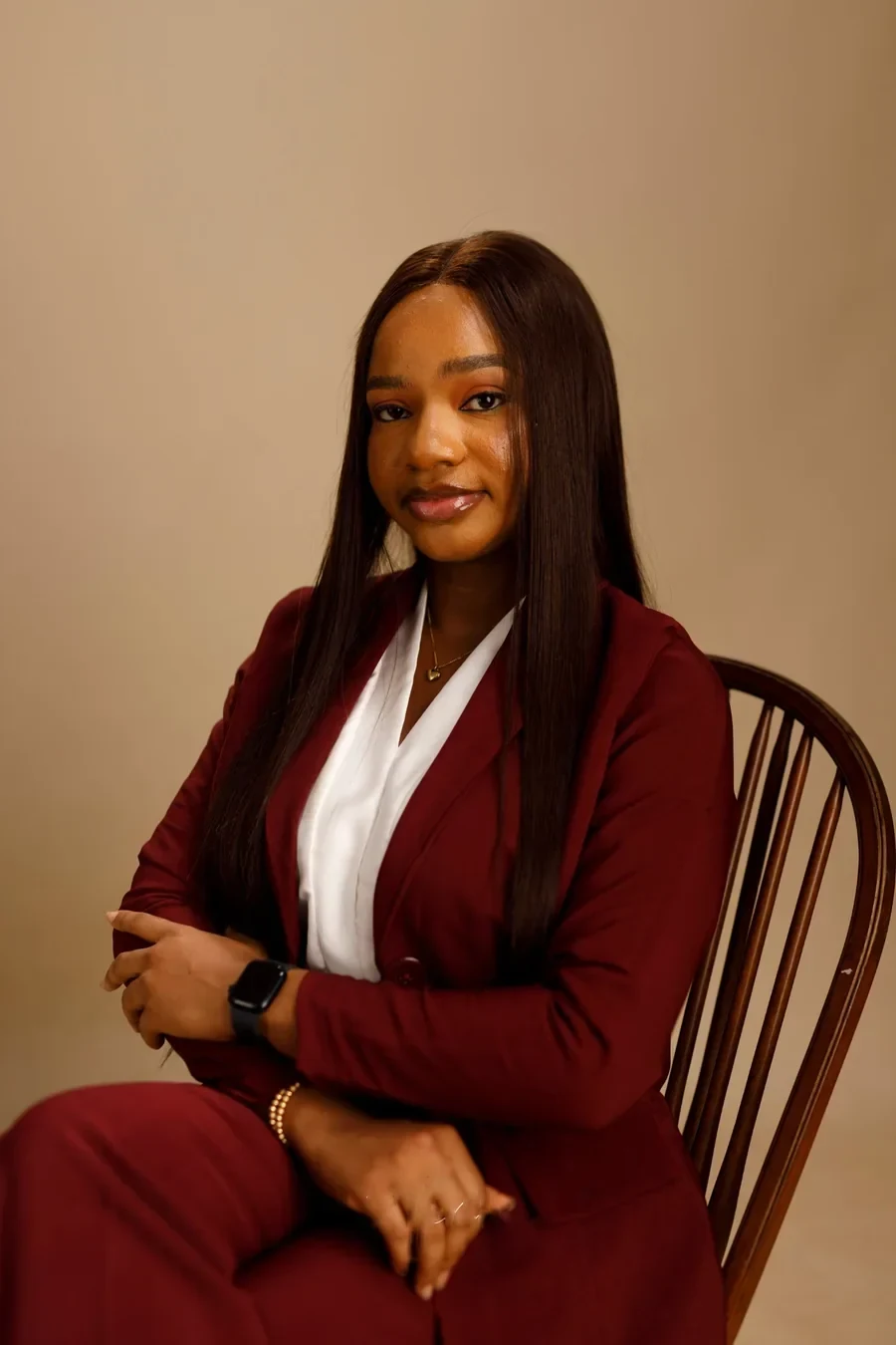
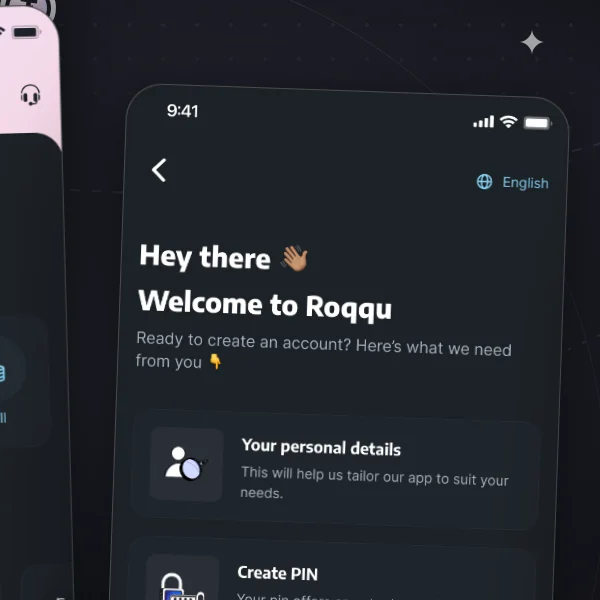
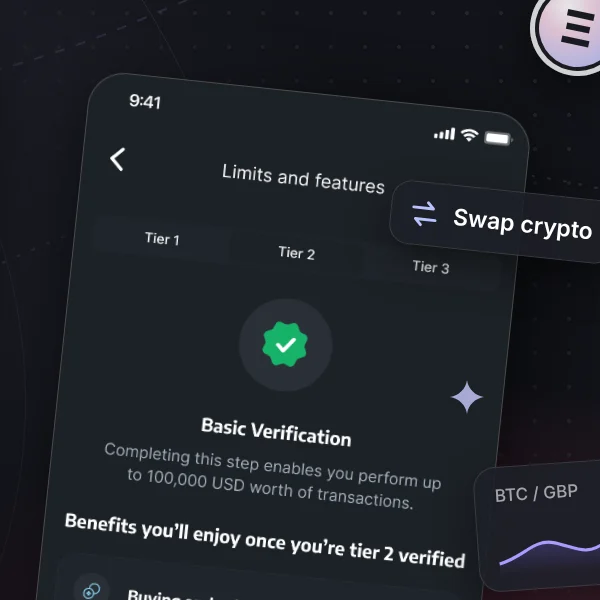
A crypto exchange and wallet for buying, selling and storing digital assets.
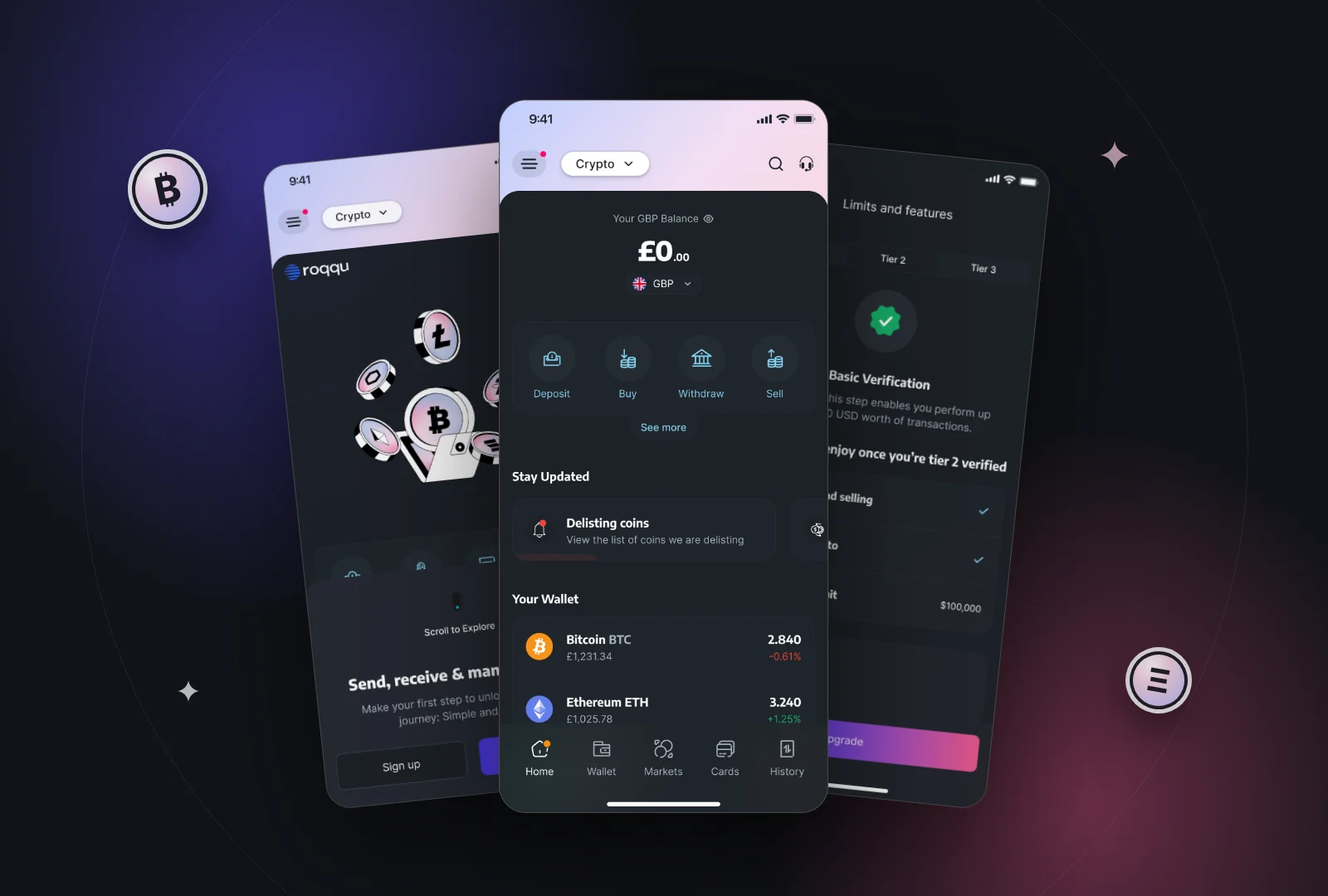

A product designer based in Lagos, Nigeria, designing for mobile, web and wearables across fintech, healthtech, gaming and eCommerce. I connect the dots between what people need, what technology makes possible, and what good design can bring to life.
A crypto exchange and wallet for buying, selling and storing digital assets.
An AI referral tool that supports patient triage and clinical referrals for spine care.
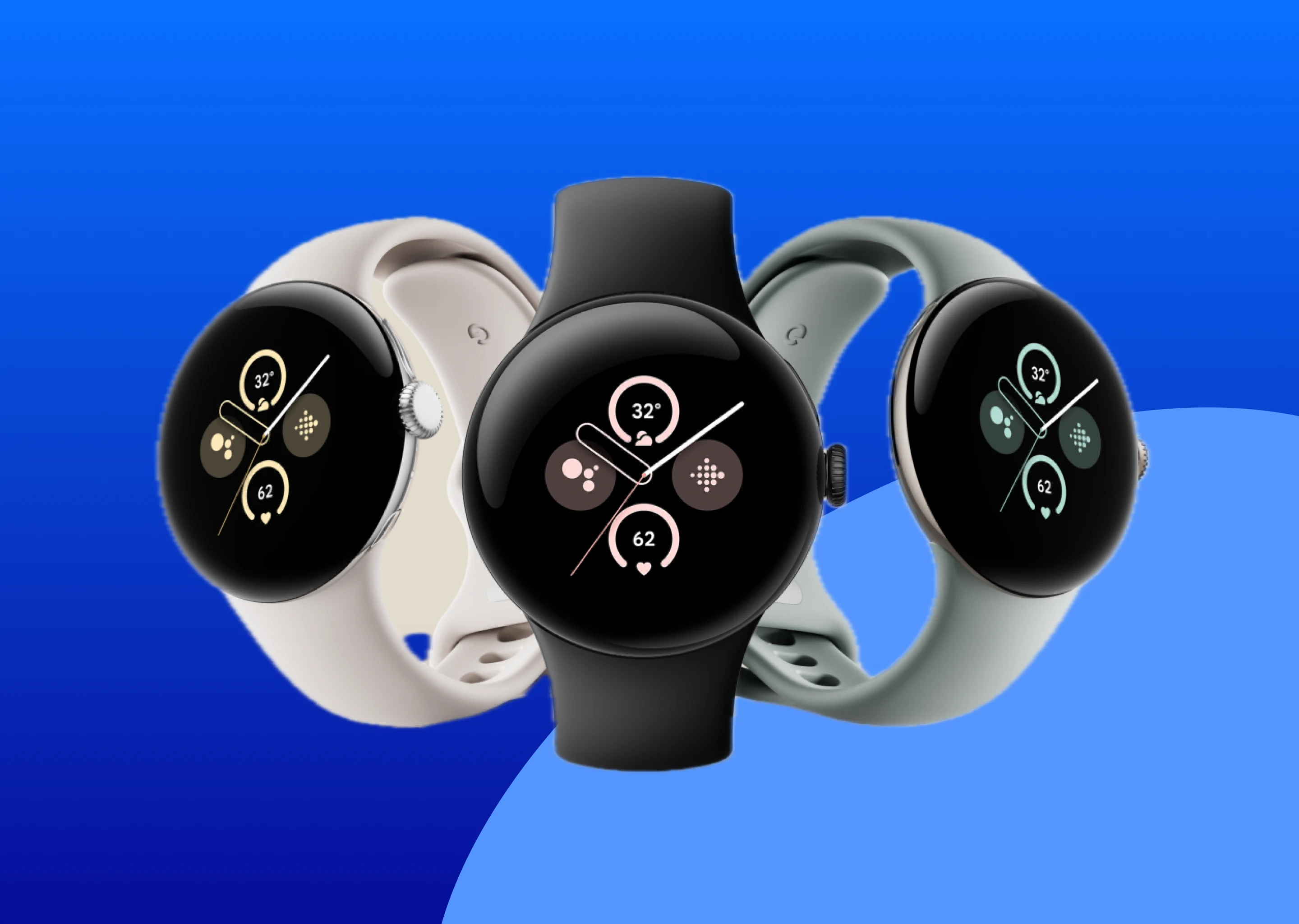
Smooth, easy experiences and integration on the Pixel Watch.
 🔒 Confidential · Unreleased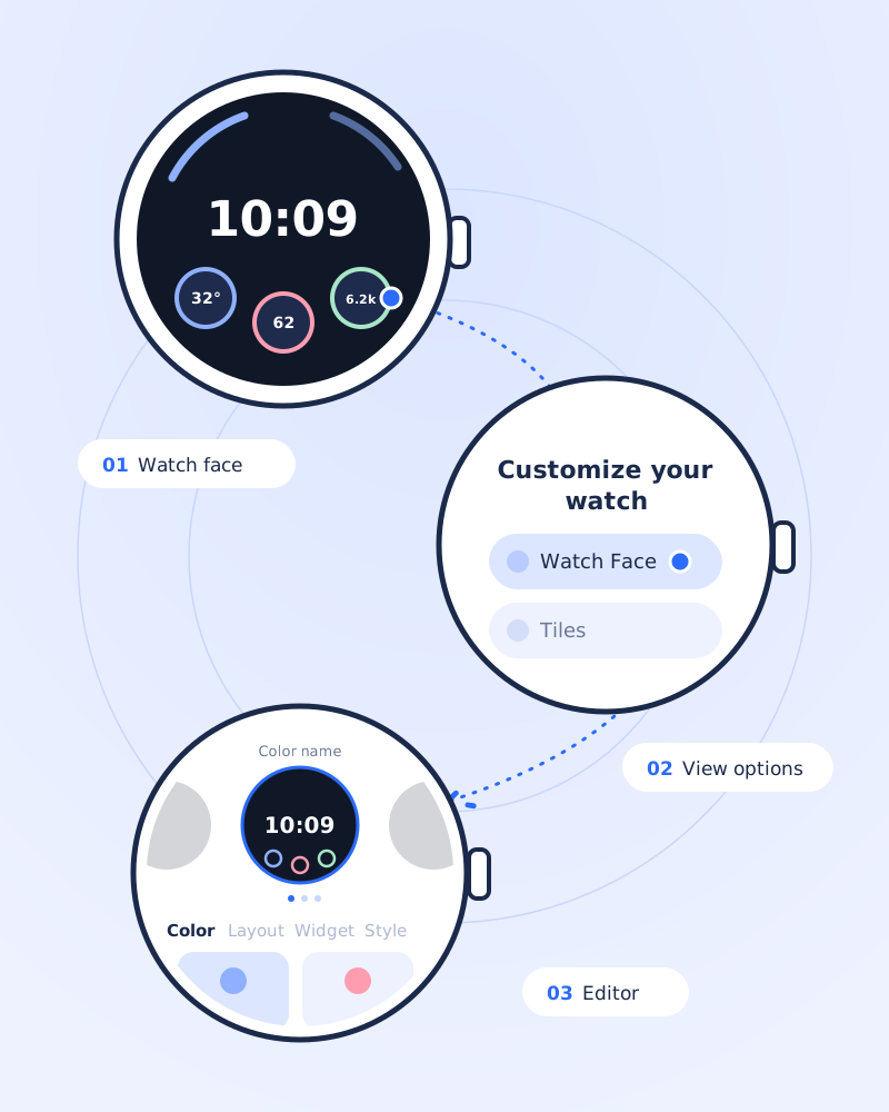
An online therapy platform connecting people in Nigeria with licensed therapists.
A digital services platform for virtual numbers, eSIMs, gift cards and bill payments.
 Roqqu
Roqqu Nexar
Nexar MyTherapist.ng
 SpineDAO
 Quid
Quid HireHuubRoqquNexarMyTherapist.ngSpineDAOQuidHireHuub
“Omotola consistently delivers innovative and visually compelling designs that elevate our projects to new heights. Beyond her technical skills, she is a natural collaborator, always ready to share insights, support her colleagues, and contribute positively to team discussions.”





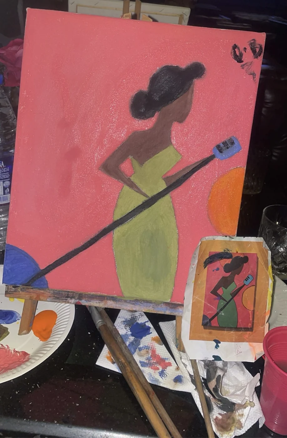
Growing up, I spent a lot of time playing video games with my brothers. While I loved the games themselves, I was equally fascinated by everything that went into making them, the characters, the visuals, the interactions, and how it all somehow came together to create an experience.
I was also the kid who loved drawing, painting, arts and crafts, and pretty much anything that involved making something from scratch. Looking back, I guess creativity and curiosity have always been a part of me.
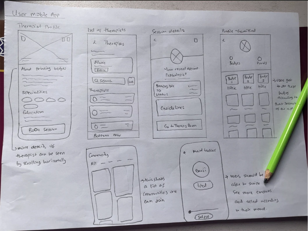
Fast forward to 2019, while working as a data entry personnel, I stumbled upon UI/UX design, and something just clicked. It felt like the perfect intersection of creativity, technology, and problem-solving.
I discovered ZuriTeam, where I got my first hands-on experience with UI/UX design through an internship. From there, I started reading design books, exploring resources, connecting with other designers, and practising every chance I got. By 2021, I had fully immersed myself in product design, and in 2022, I began exploring other creative interests, including game design and digital assets.
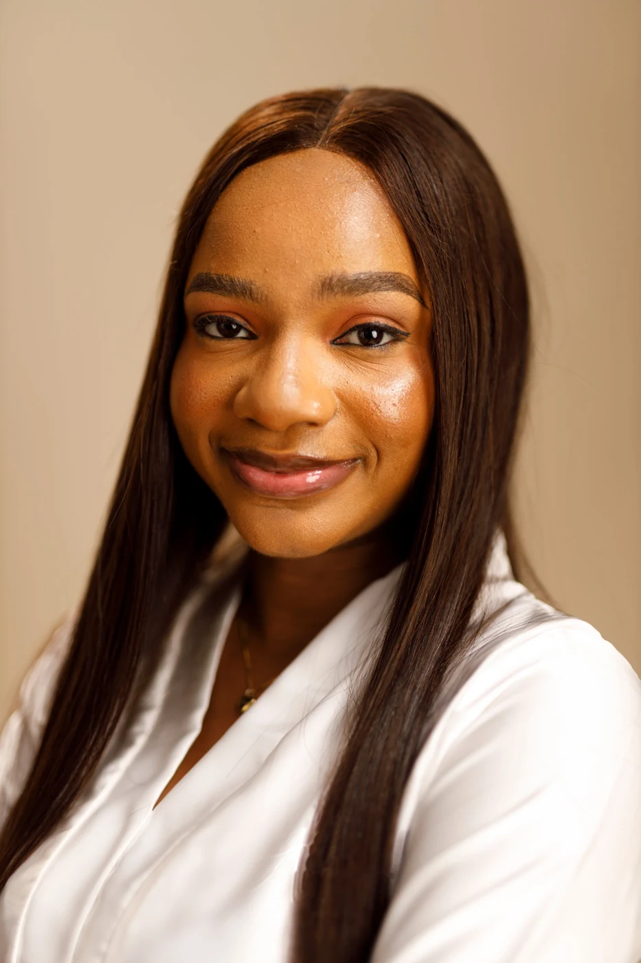
Interestingly, studying Systems Engineering gave me an entirely new perspective on design. In engineering, you're taught to understand how different components interact and work together to make a larger system function effectively.
I realised that design isn't so different. Typography, layouts, visual hierarchy, interactions, and even the smallest details all need to work in harmony to create an experience that feels seamless and intentional.
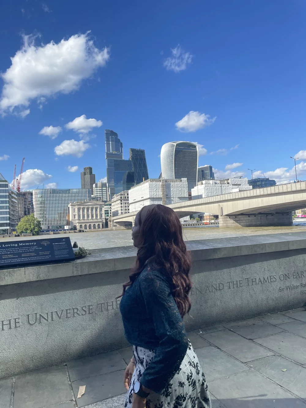
Five years into this journey, I'm still that curious kid at heart. Still exploring, experimenting, learning, and finding new ways to bring ideas to life.
Only now, I get to combine my love for creativity, technology, and systems thinking to build experiences that are not just beautiful, but meaningful, intuitive, and centred around the people who use them.
Roqqu is a digital finance platform making it easier to buy, sell, store, and exchange cryptocurrencies.
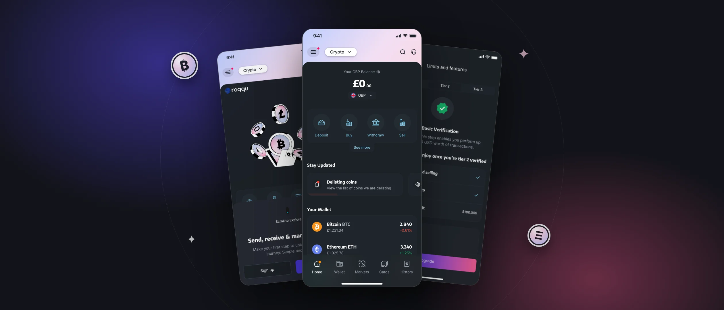
Money is evolving, and so is the way we save, move, and interact with it. Yet, for many people, navigating cryptocurrency still feels unnecessarily complicated.
Roqqu bridges the gap between digital assets and everyday financial needs, helping everyone, from first-time users to experienced traders, manage their money with greater ease and confidence.
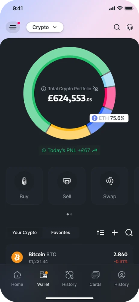
Making cryptocurrency accessible is one thing. Getting people to use it, find value in it, and keep coming back is another. Customer data revealed friction across key journeys: users dropping off during onboarding, newly registered customers remaining inactive, and limited engagement across certain features.
How might we simplify the experience, encourage meaningful engagement, and turn new users into active, returning customers?
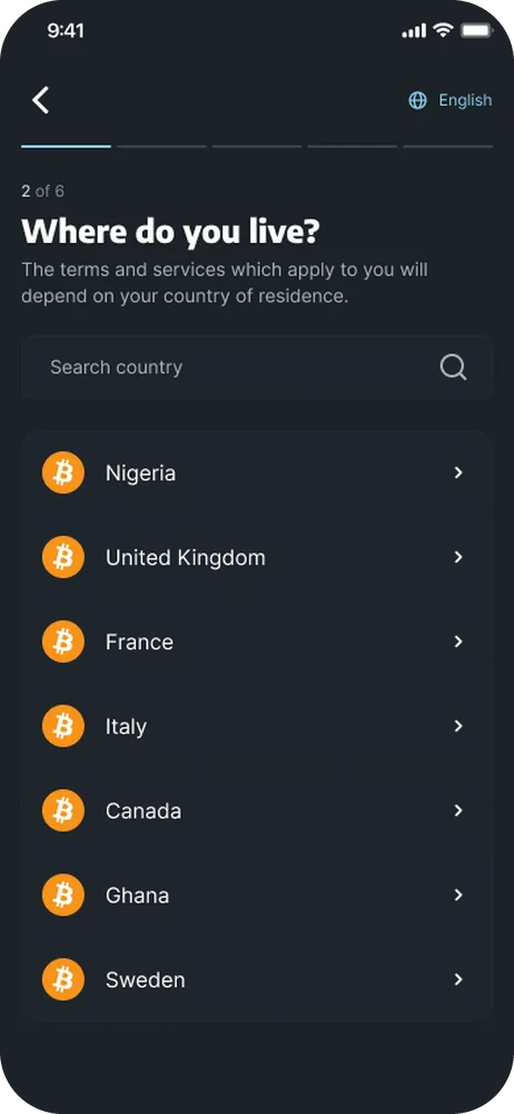
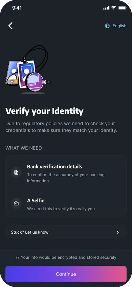
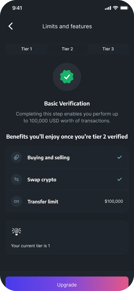
Working with the design, research, product, and engineering teams, I explored these challenges through customer insights, usability testing, and iterative improvements. I was able to contribute to solutions that simplified workflows, improved feature discoverability, and addressed friction across critical user journeys.
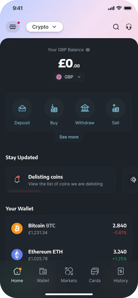
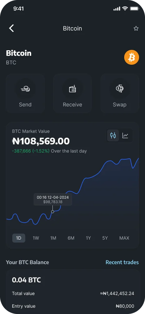
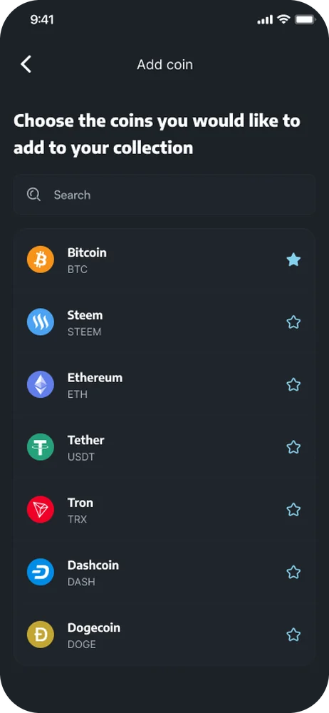
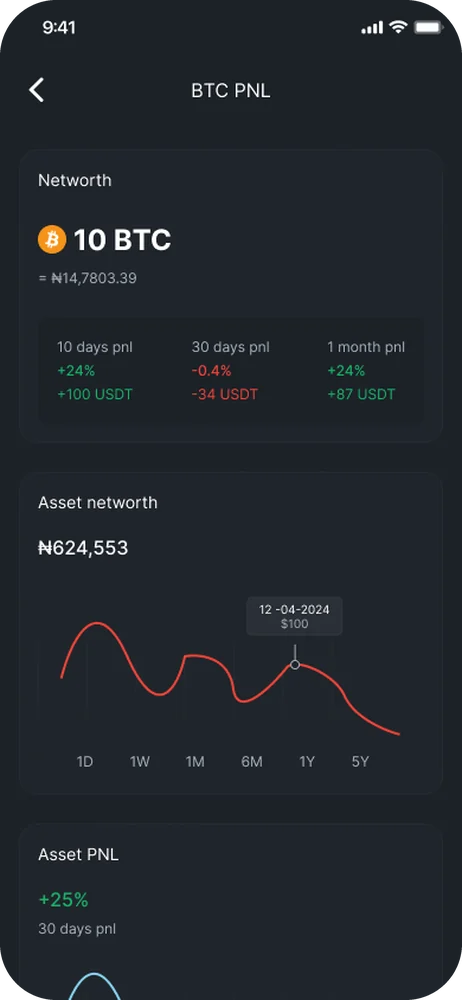
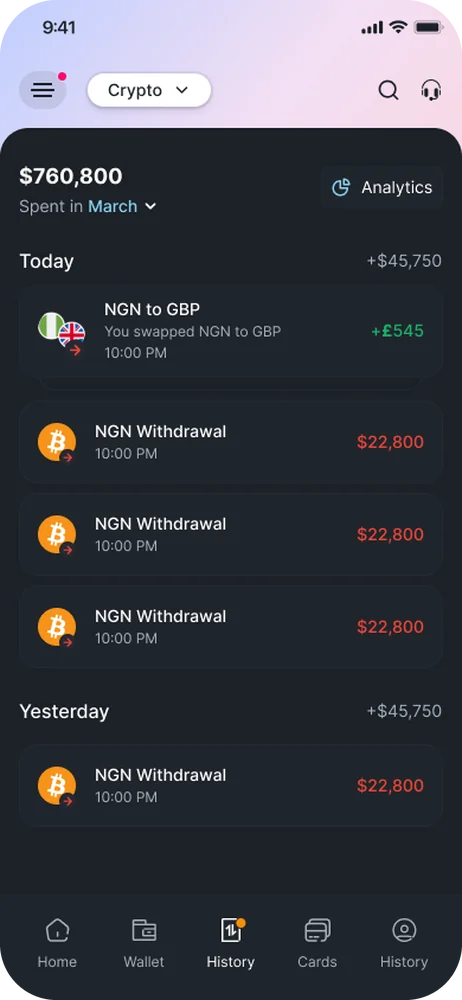
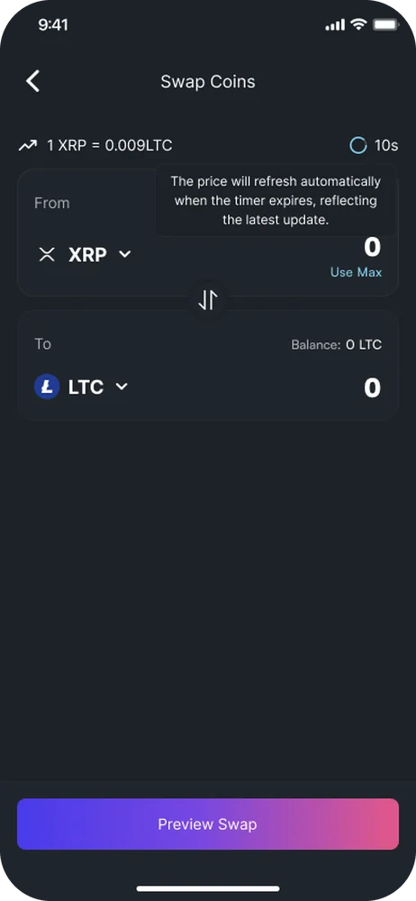
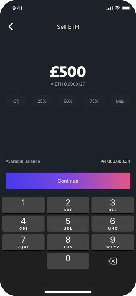
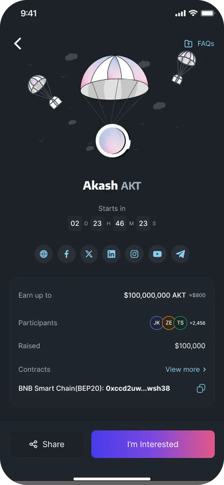
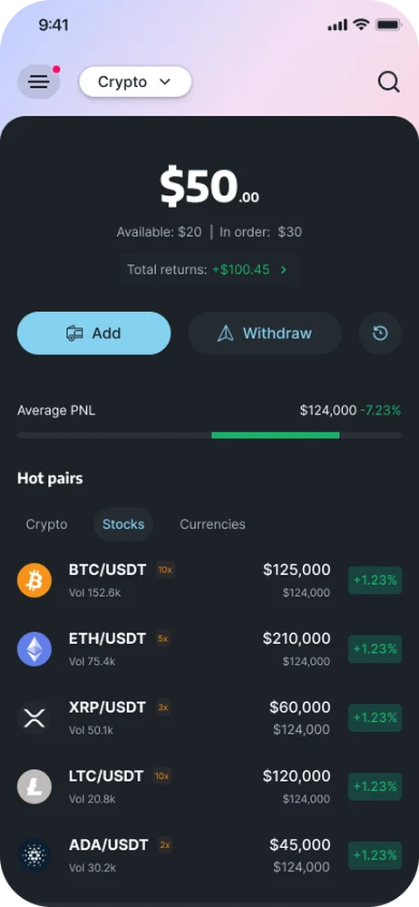
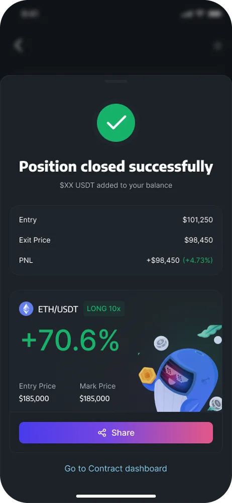
Beyond improving existing experiences, we explored a different question:
What if interacting with cryptocurrency could feel less like a task and more like an experience?
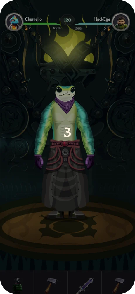
This led to Q-Kombat, a crypto-gaming initiative combining gaming with Play-to-Earn (P2E) mechanics to encourage participation and give users more reasons to engage with Roqqu.
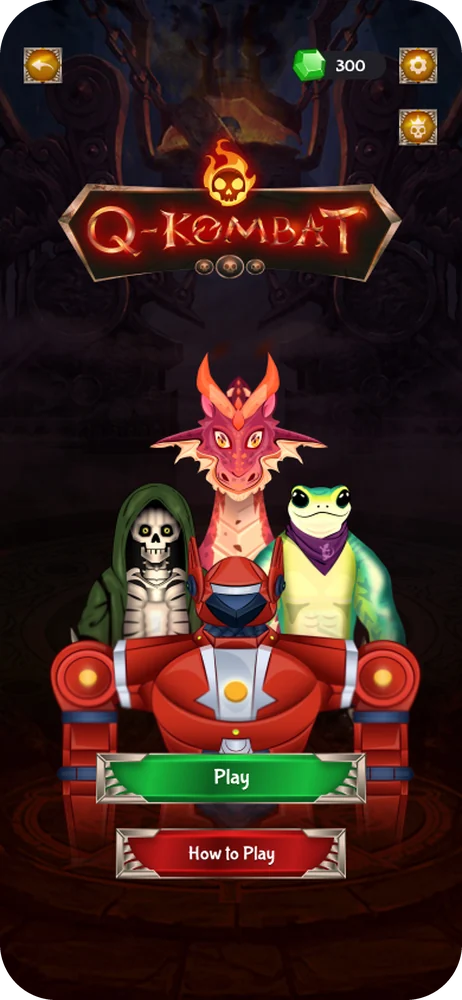
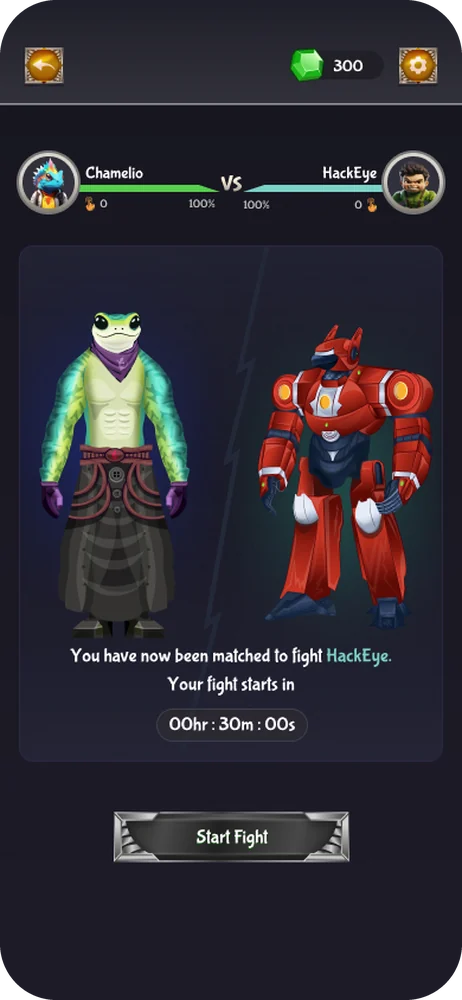
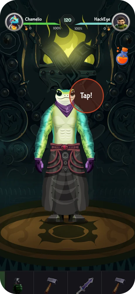
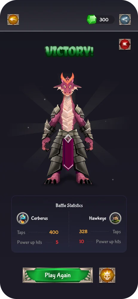
Collaborating with the research team, I explored user behaviour, gaming patterns, and reward mechanics to shape the experience. These insights guided the user flows and interactions, helping us balance playful engagement with intuitive usability and business goals.
Through continuous feedback and collaboration, I refined the experience to make participation simple, rewarding, and approachable.
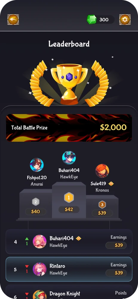
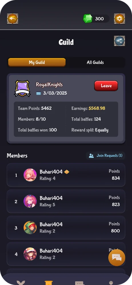
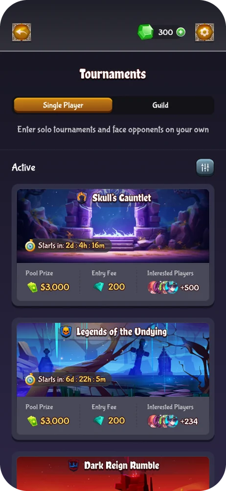
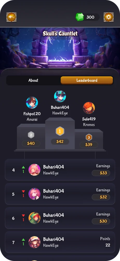
Meaningful improvements didn't come from one big redesign, but from consistently identifying friction, testing ideas, and refining experiences across the platform. Through multiple design initiatives and cross-functional collaboration, I contributed to improvements in onboarding, product adoption, and operational efficiency.
These outcomes were the result of broader team efforts, with my contributions focused on translating customer insights into practical, user-centred design solutions.
Working on Roqqu reinforced that good design goes beyond creating beautiful interfaces. It's about understanding people's problems, making decisions backed by evidence, and continuously improving what already exists.
It also showed me the value of collaboration. Working across research, engineering, product, and design brought different perspectives to the table, challenged assumptions, and helped shape better solutions.
My biggest takeaway?
Data tells you where to look, research helps you understand why, and design gives you the opportunity to make things better.
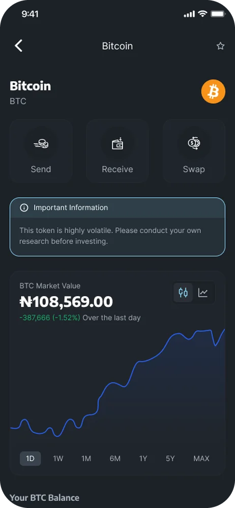
Making mental wellness more accessible, one experience at a time.
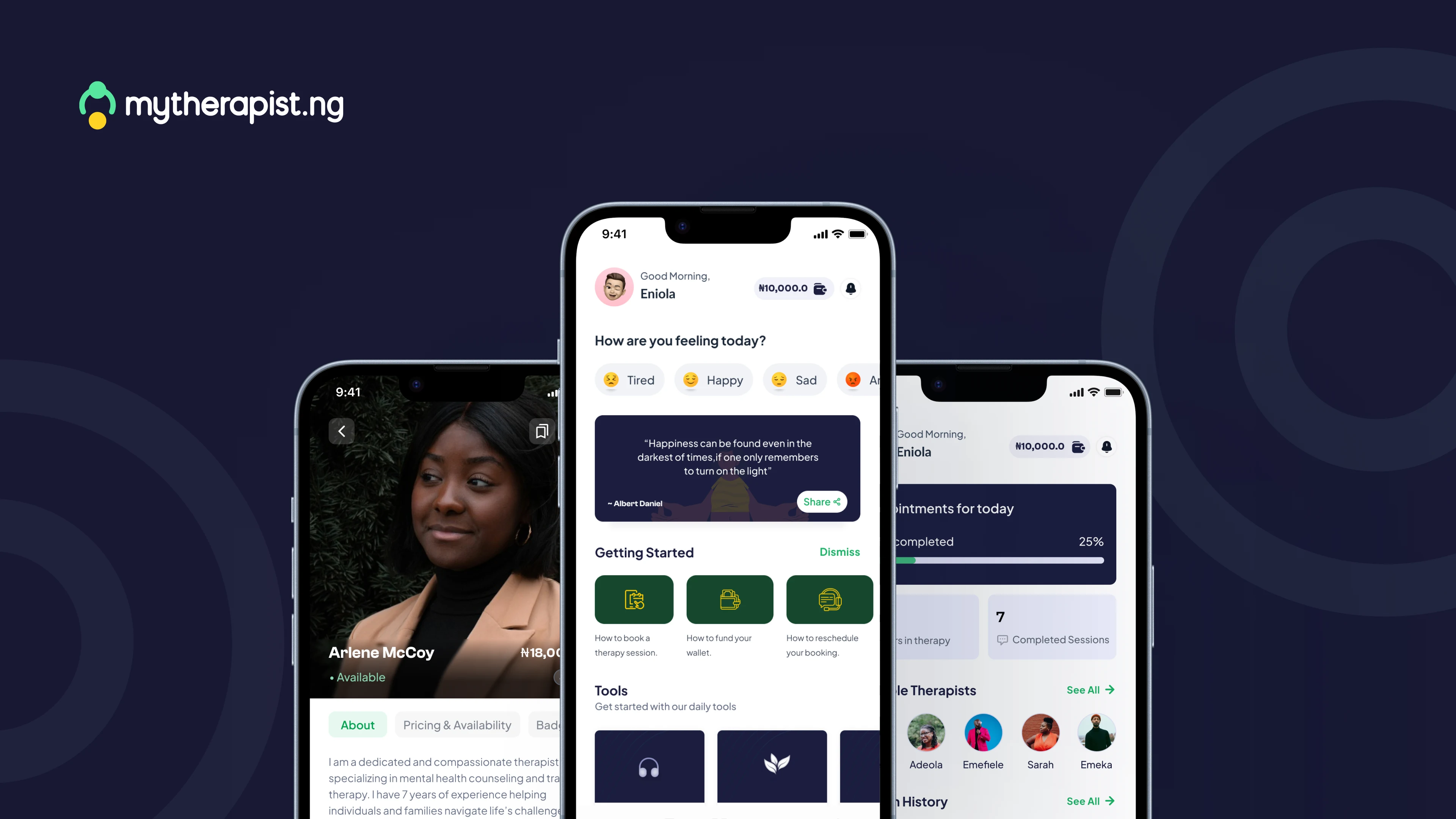
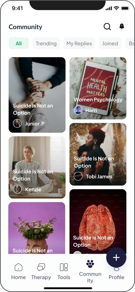
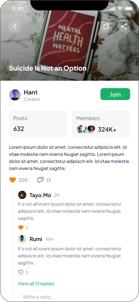
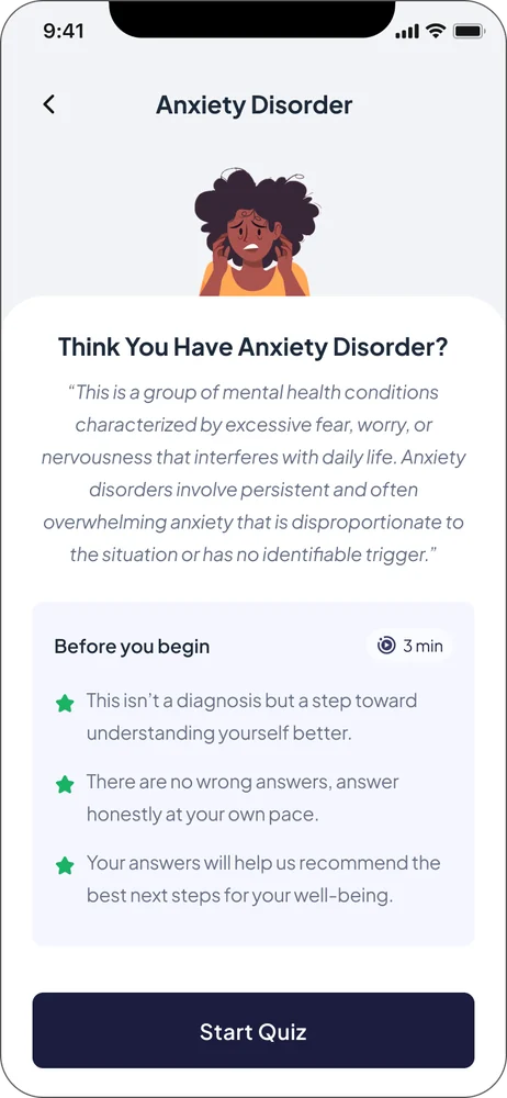
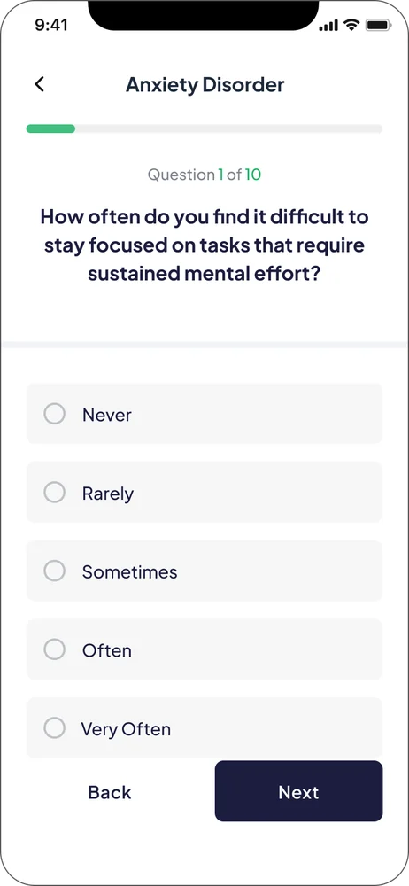
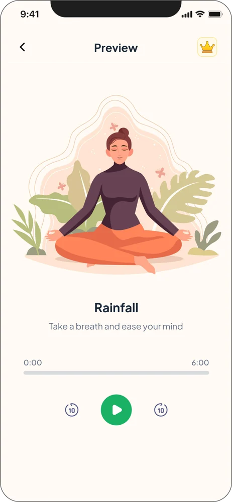
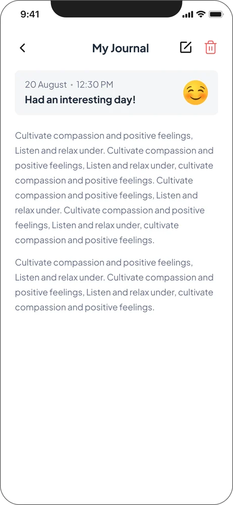
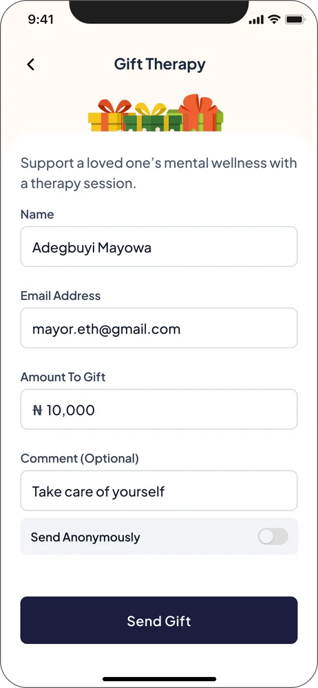
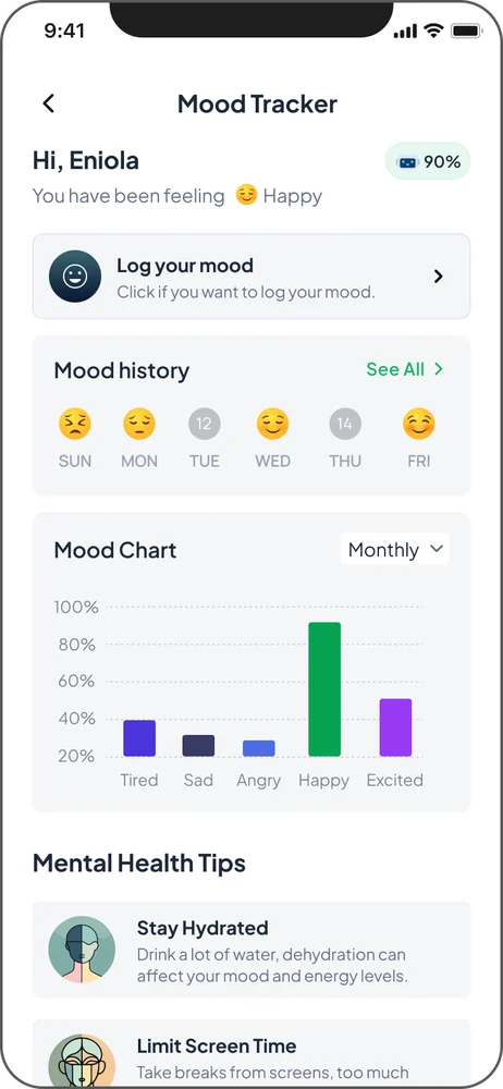
MyTherapist.ng is a mental healthcare platform connecting people with professional therapists, making it easier to access support, book therapy sessions, and take meaningful steps toward their mental well-being.
Taking the first step toward better mental health isn't always easy, especially in a society where seeking therapy is often surrounded by stigma and misconceptions.
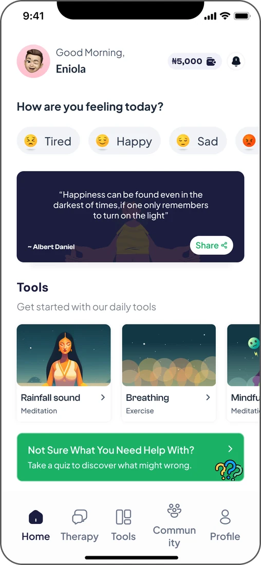
The goal was simple: make seeking help feel less intimidating, more accessible, and like a natural part of everyday life.
In Nigeria, conversations around mental health are still evolving. For many people, therapy feels unfamiliar, and the stigma surrounding mental healthcare can make seeking support even more difficult. Beyond these cultural barriers, the platform needed a more intuitive experience that helped users discover therapists, book sessions, and stay engaged with their mental wellness journey.
So the question became: how do we make therapy feel simpler and more welcoming, and help people stay committed to their mental well-being once they've begun?
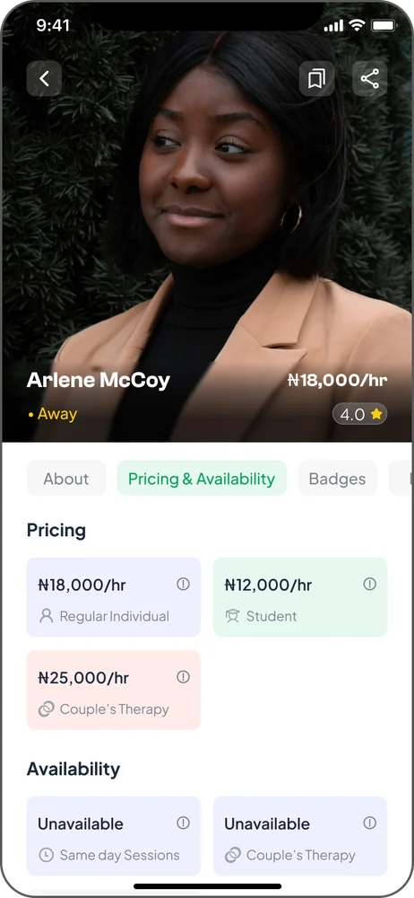
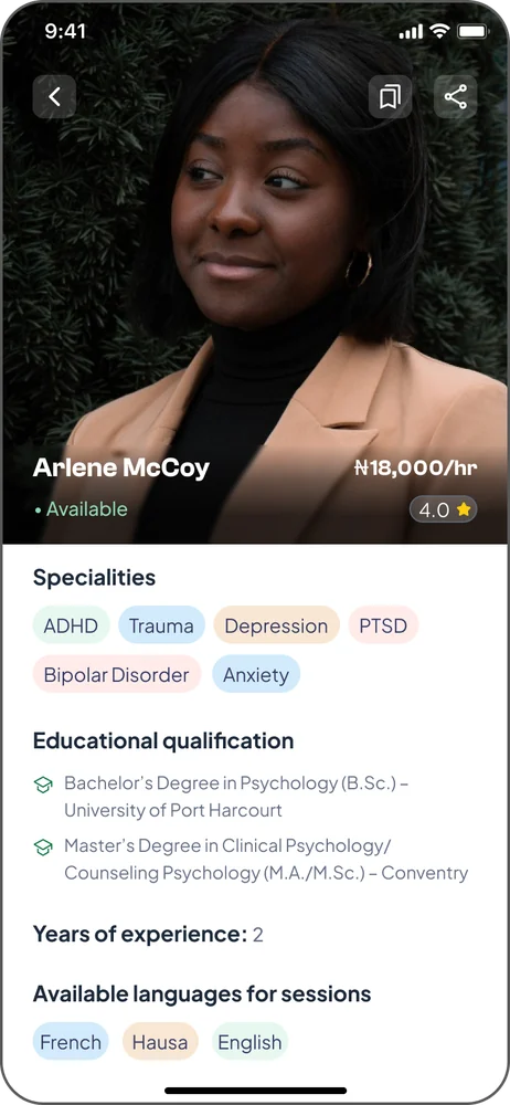
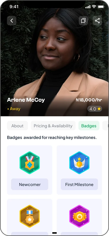
I led the product redesign, starting with understanding the people on both sides of the experience. Through interviews with therapists and existing users, I listened to their challenges, expectations, and pain points, using these insights to identify opportunities for improvement.
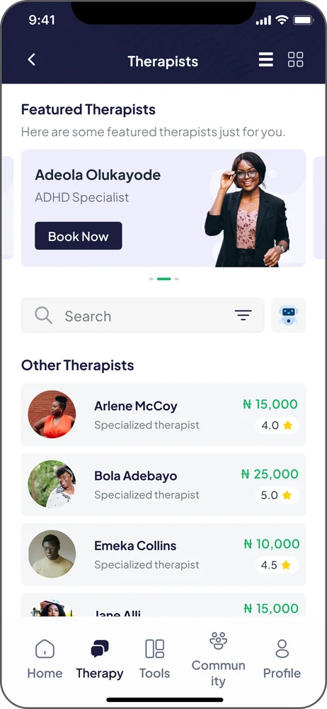
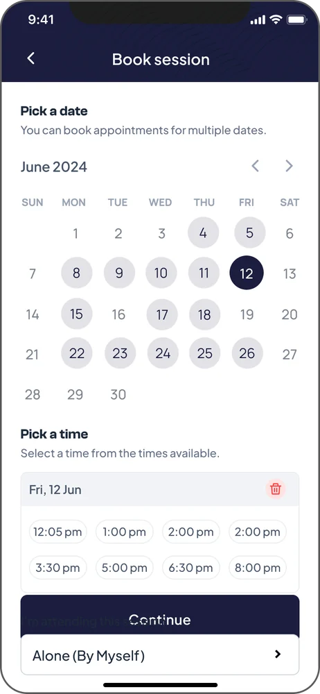
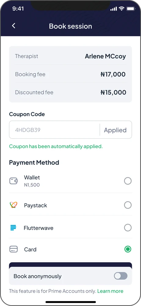
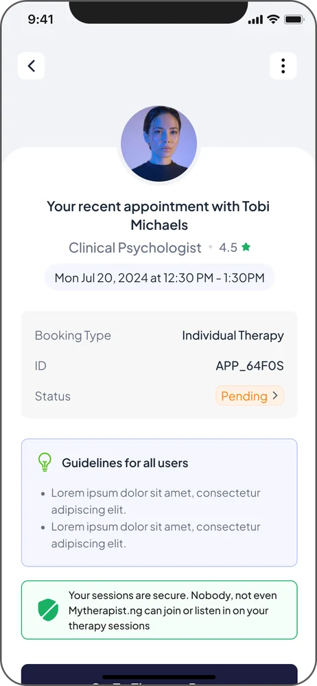
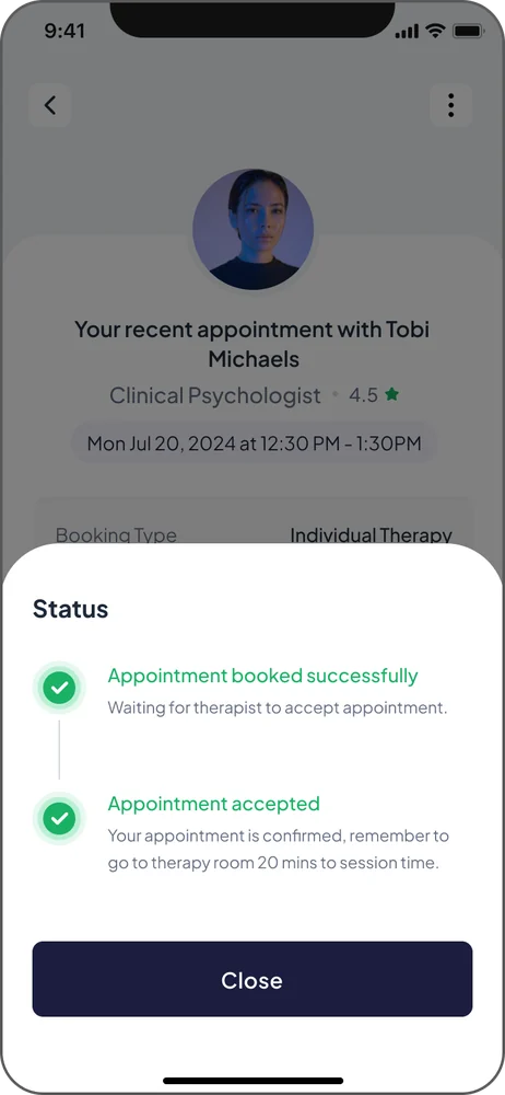
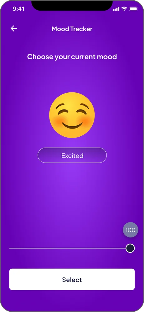
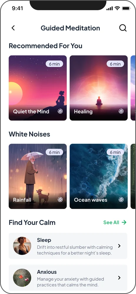
The redesign focused on removing unnecessary friction and creating an experience that felt approachable, reassuring, and easy to navigate. I simplified the therapist discovery and booking journeys, making it easier for users to find suitable professionals, schedule sessions, and manage their therapy experience.
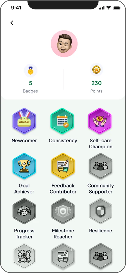
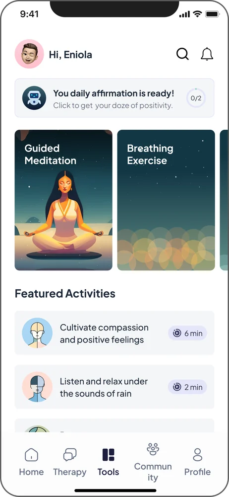
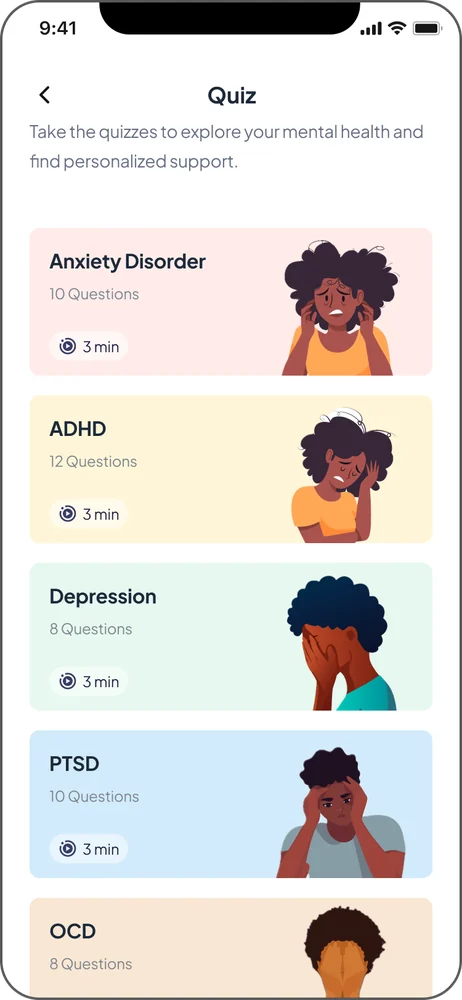
Beyond usability, I wanted the platform to feel less clinical and more encouraging. This led to the introduction of gamification features, including therapy milestones, achievement badges, and rewards that celebrated users' progress.
These elements were designed to recognise consistency, encourage continued participation, and make the journey toward better mental health feel more positive.
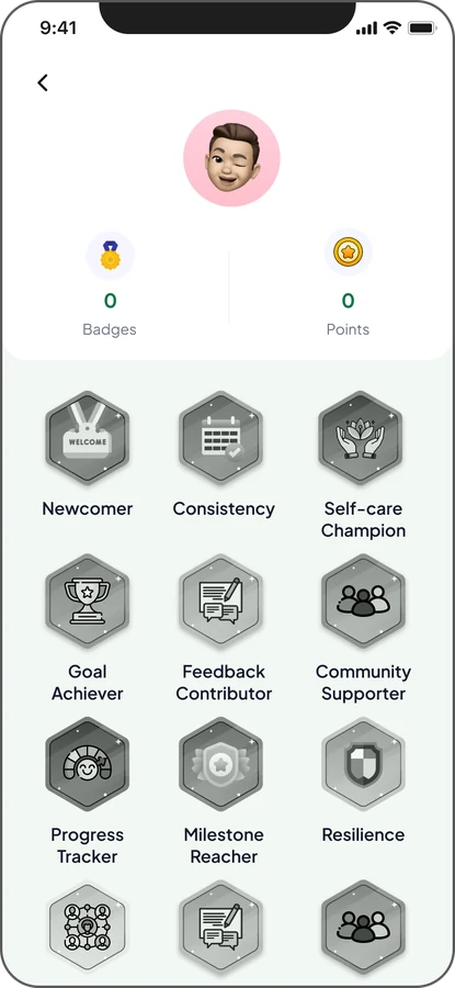
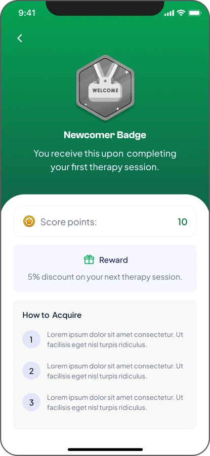
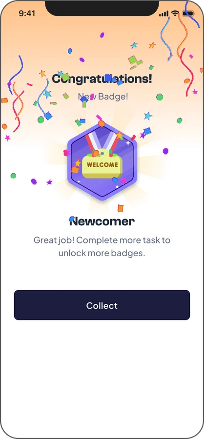
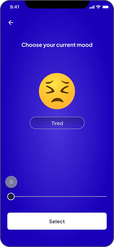
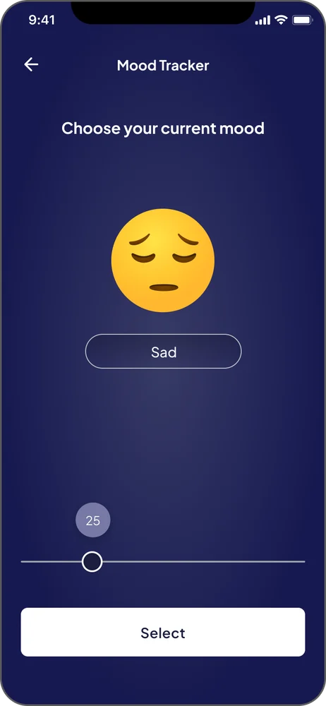
Throughout the process, I refined the experience through user feedback and design iterations, balancing accessibility, simplicity, and the emotional needs of people seeking support.
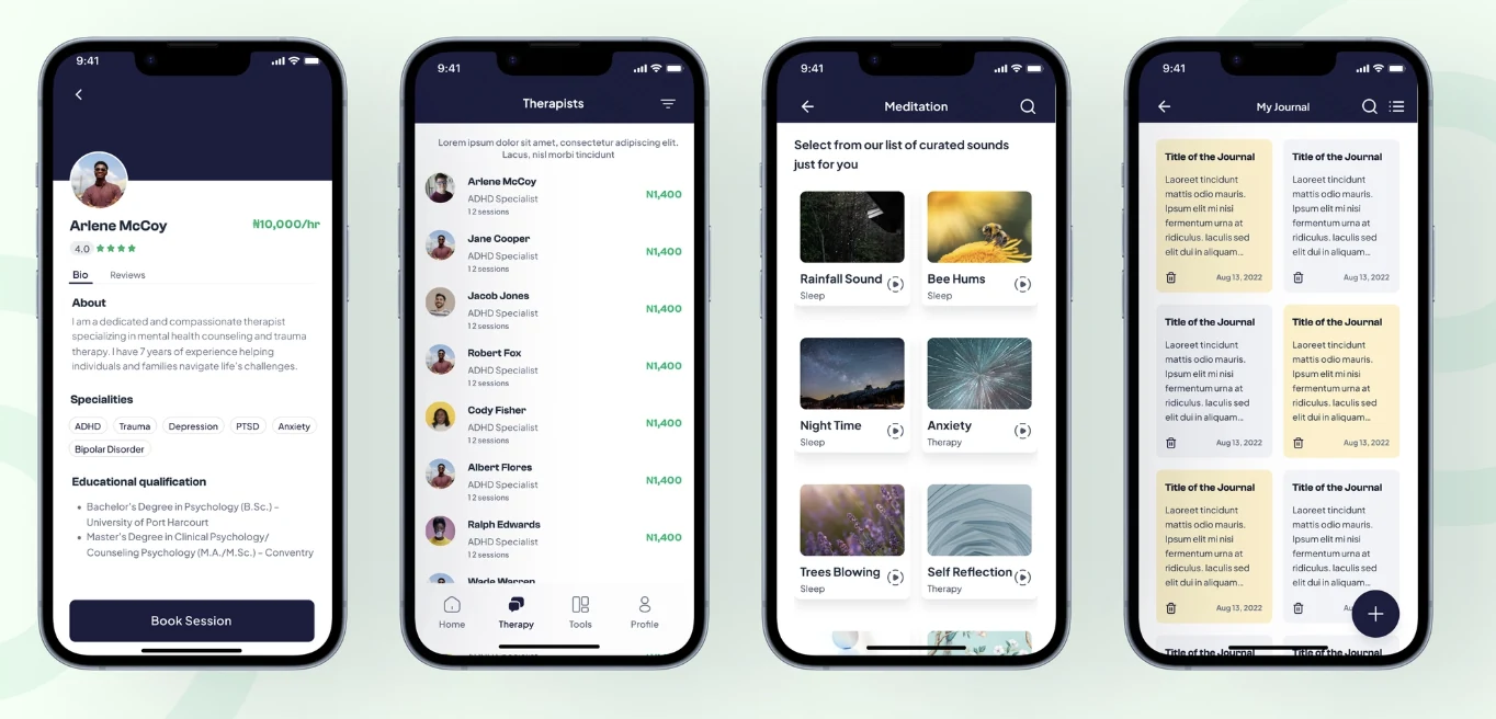
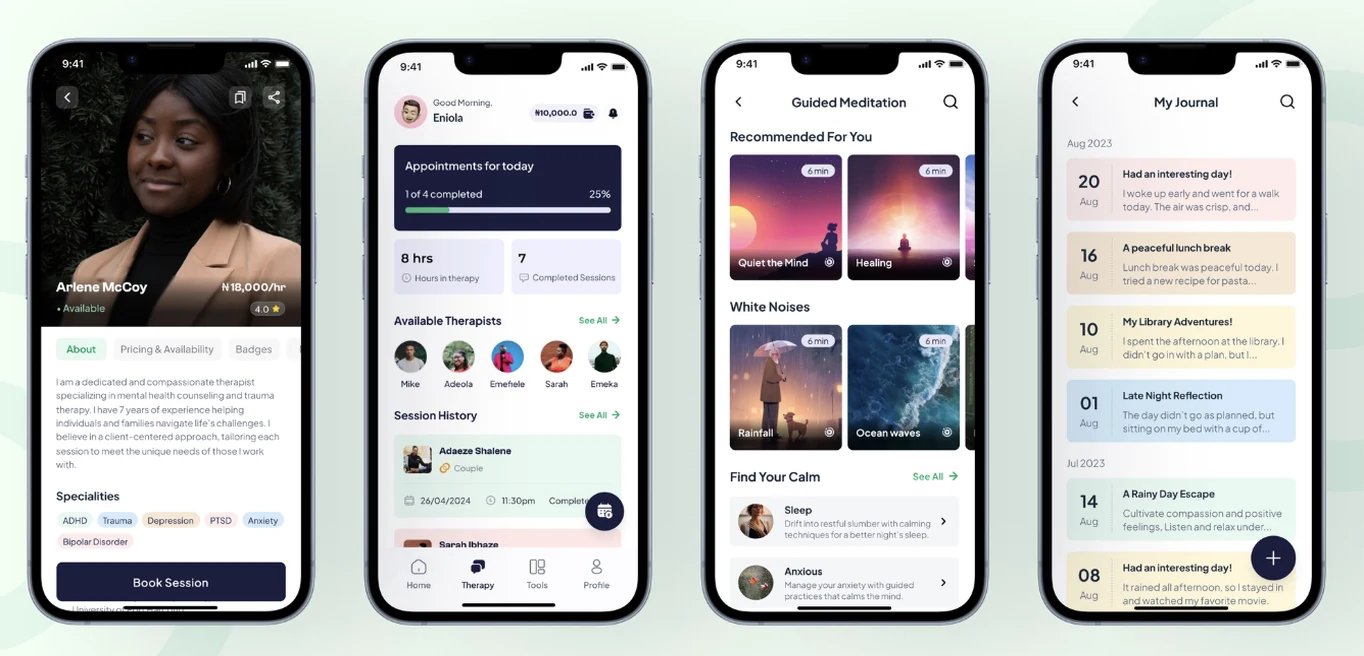 BeforeAfter
By addressing usability challenges and introducing more supportive interactions, we worked toward making therapy easier to access and more approachable for users who might otherwise hesitate to seek help.
Working on MyTherapist.ng taught me that designing for healthcare requires more than solving usability problems. It means understanding people's emotions, vulnerabilities, and the real-world barriers that influence their decisions.
Conversations with therapists and users helped me see the experience from different perspectives and make more informed design decisions.
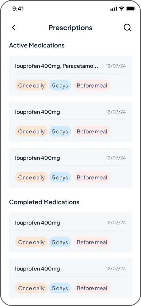
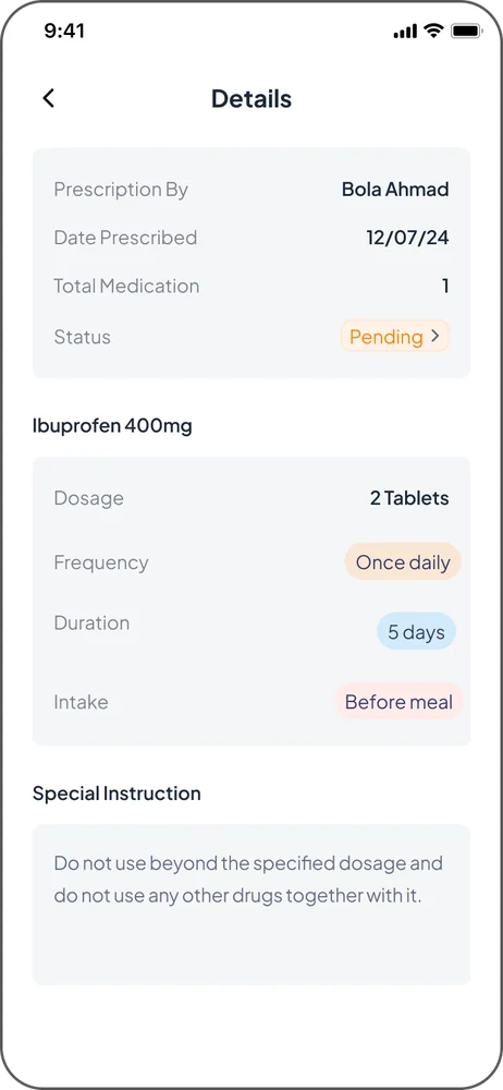
Exploring more intuitive and meaningful smartwatch experiences.
Great technology should feel effortless, especially when it's designed to fit into the smallest moments of our everyday lives.
During my UX Design internship at Google, I worked within the Wear OS ecosystem, contributing to design explorations around watch face personalization and Complications, the small elements that surface useful information directly on a smartwatch.
My work focused on exploring opportunities to make smartwatch interactions more intuitive, accessible, and meaningful, while considering both user needs and the broader product ecosystem.
Smartwatches offer a wide range of capabilities, but bringing these experiences together in a way that feels simple and intuitive presents unique design challenges. With limited screen space, different interaction patterns, and diverse user expectations, even small design decisions can significantly shape the overall experience.
How might we make smartwatch experiences feel more intuitive and personal without adding unnecessary complexity?
This question guided my exploration as I worked with the team to understand user needs and identify opportunities to improve the experience.
I began by reviewing existing research and usability findings to better understand user behaviour, expectations, and opportunities within the experience.
Using these insights, I explored multiple design directions through sketches, wireframes, and interactive prototypes, evaluating ideas against usability principles, product goals, and technical constraints.
Throughout the process, I collaborated with designers and cross-functional stakeholders, incorporating feedback and refining concepts through multiple iterations.
I also used Figma, Watch Flow, and Google AI Studio to prototype and simulate interactions, helping communicate design ideas and evaluate experiences across different contexts.
My work resulted in a collection of research-informed design concepts and interactive prototypes exploring opportunities within the Wear OS experience. These explorations helped communicate potential design directions and supported discussions around usability, feasibility, and the future of smartwatch interactions.
Due to confidentiality agreements, specific research findings, design concepts, and internal prototypes cannot be shared publicly.
Working on Wear OS challenged me to think differently about interaction design. With limited screen space, every element, gesture, and piece of information had to serve a clear purpose.
I developed a deeper understanding of designing for small form factors, balancing functionality with simplicity, and creating thoughtful interactions within constrained environments.
Beyond interface design, the experience strengthened my skills in research synthesis, rapid prototyping, and navigating technical constraints within a large product ecosystem.
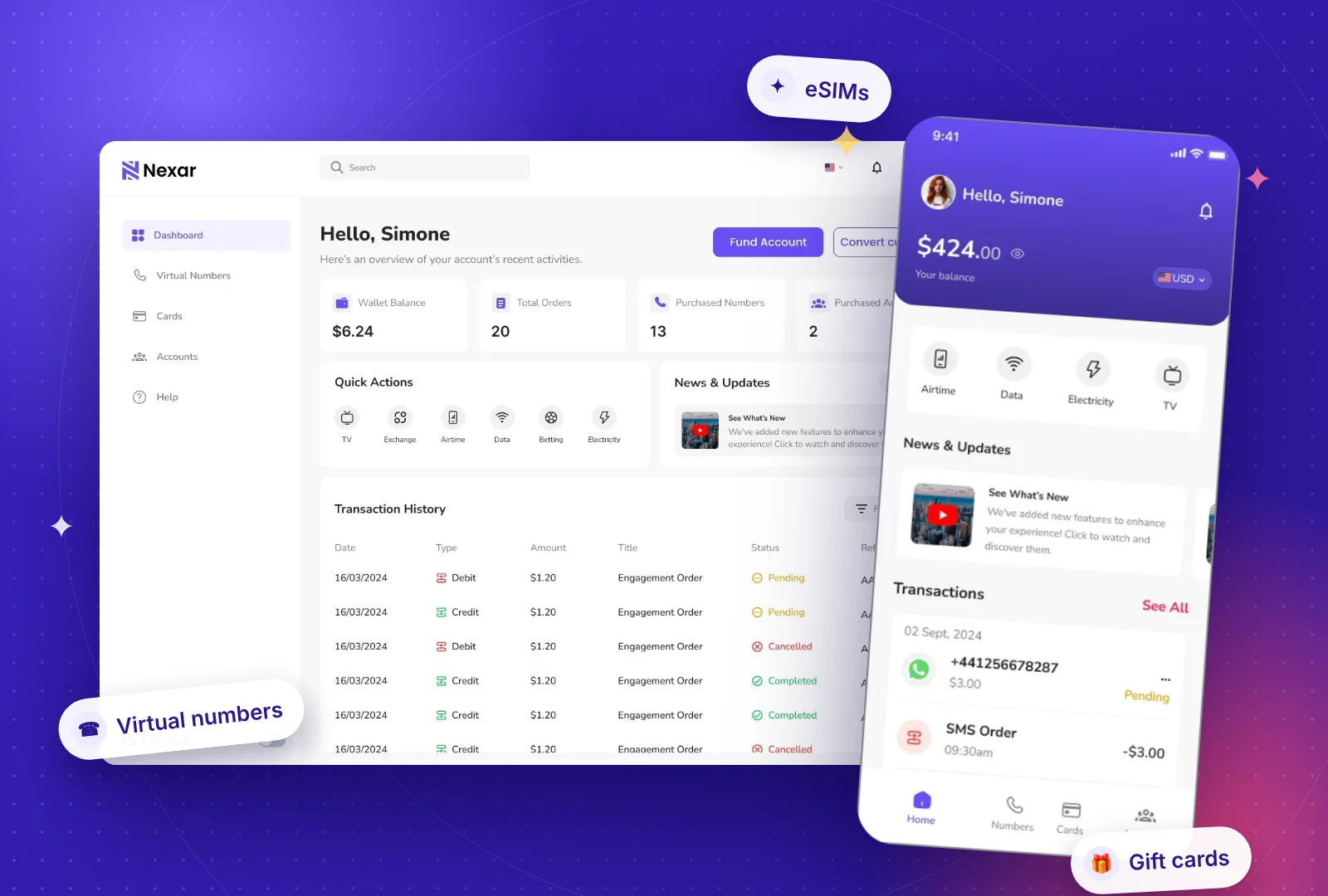
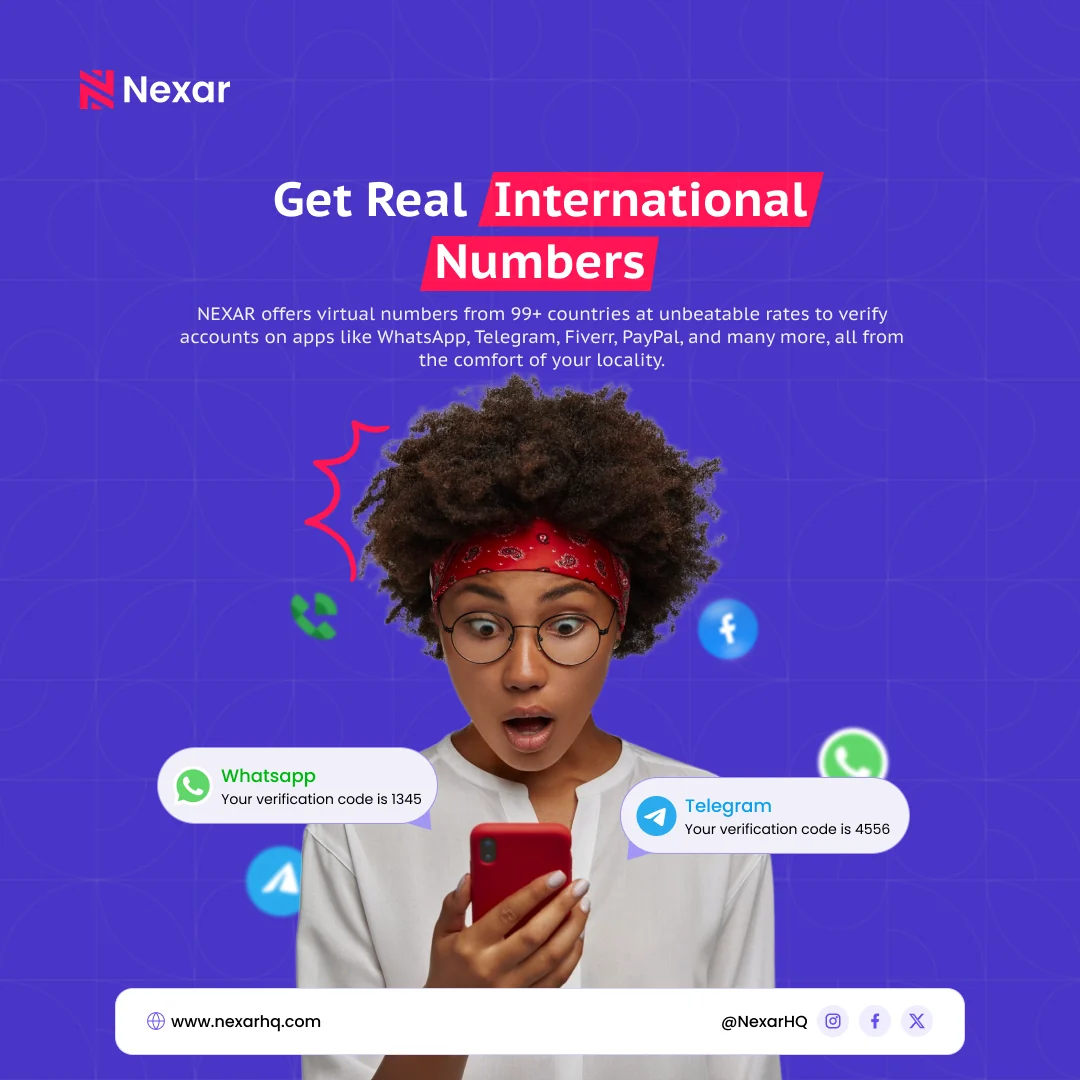
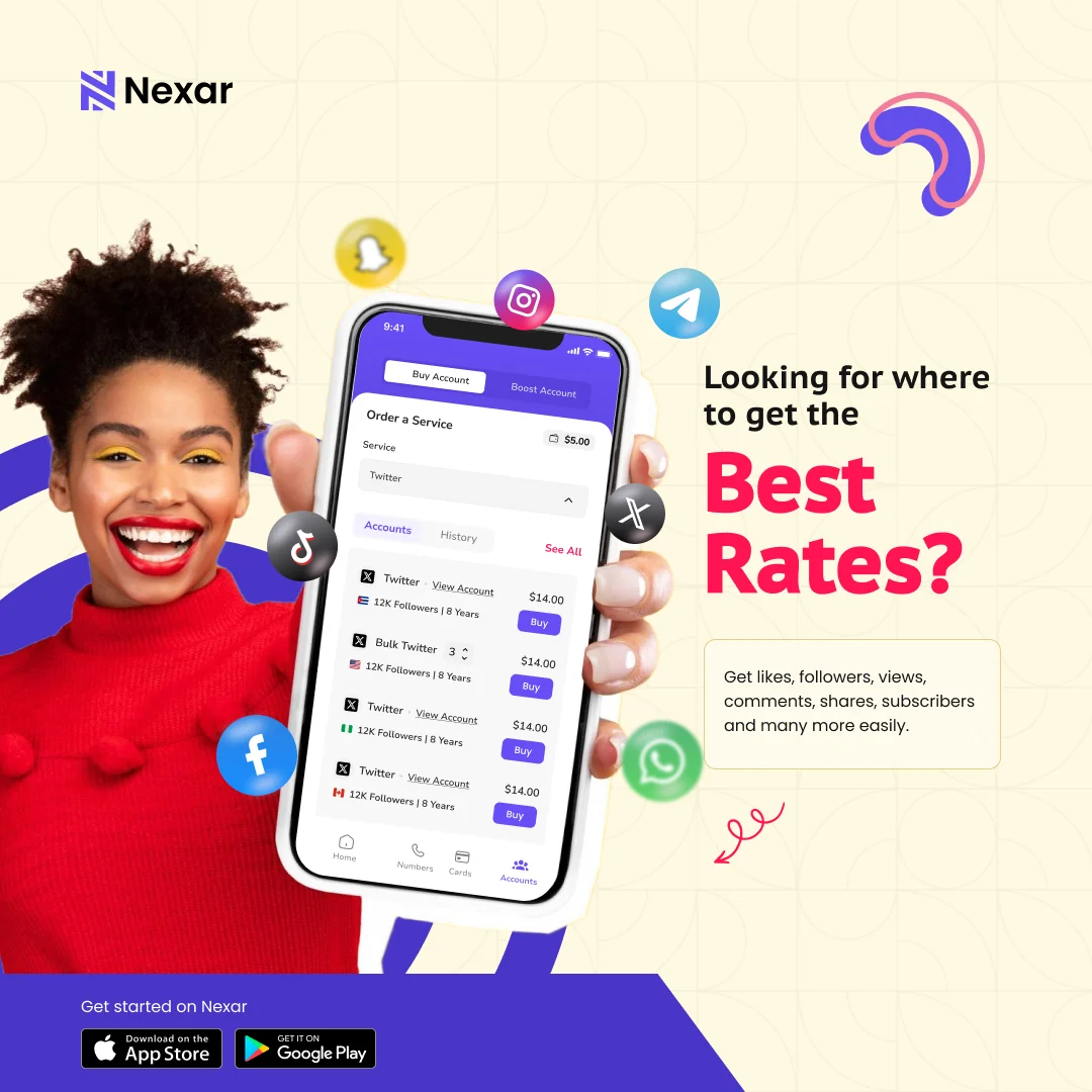
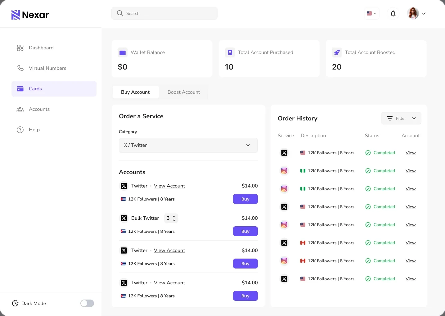
Nexar is an all-in-one digital services platform that brings virtual numbers, eSIMs, bill payments, gift cards, and social media growth services into one place.
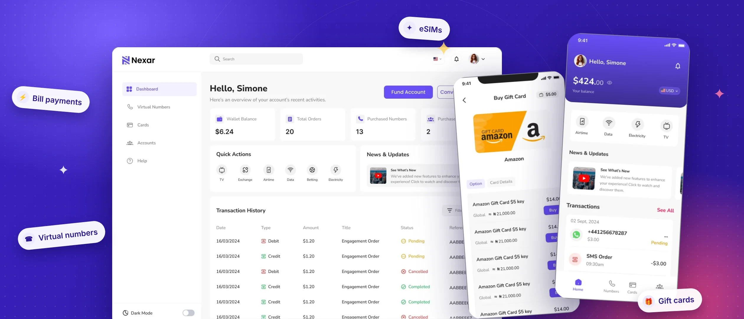
Built for individuals, creators, travellers, and businesses.
From staying connected while travelling to paying everyday bills and growing an online presence, digital services have become essential to how we live and work. But accessing these services often means navigating multiple platforms, unfamiliar processes, and fragmented experiences.
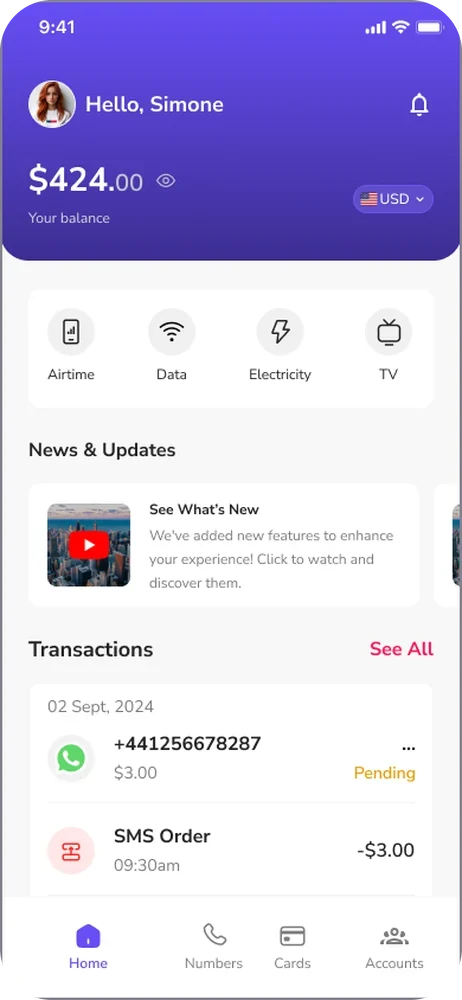
Bringing multiple services into one platform creates convenience, but it also introduces a design challenge:
How do you make different services feel like one seamless experience?
With users navigating different journeys, from purchasing an eSIM to paying bills or boosting social media accounts, the opportunity was to reduce complexity, improve navigation, and make completing everyday tasks feel simpler.
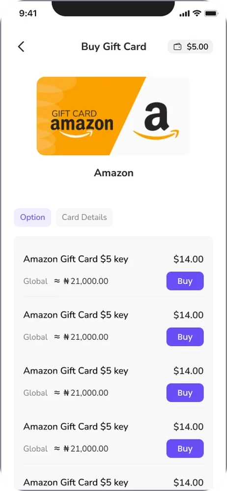
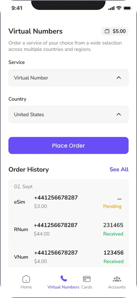
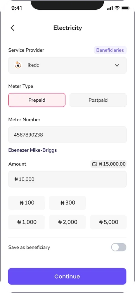
I spearheaded the redesign of Nexar's mobile application, rethinking key user flows and the overall product experience with a stronger focus on usability, consistency, and accessibility.
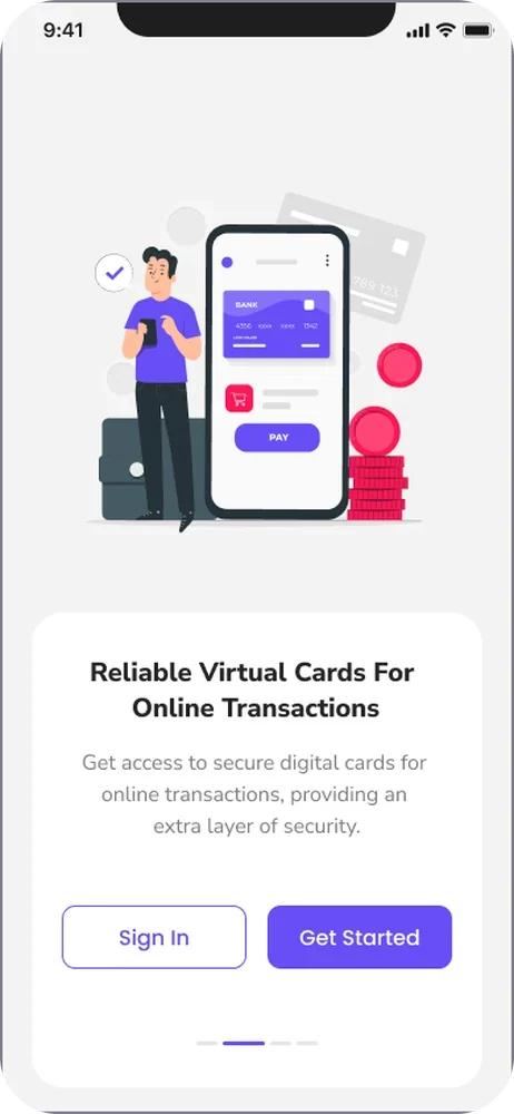
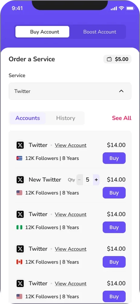
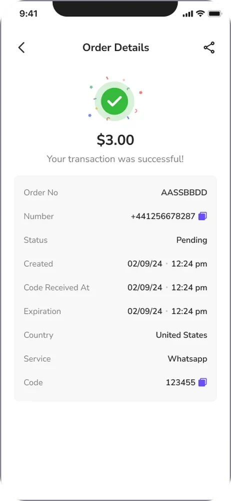
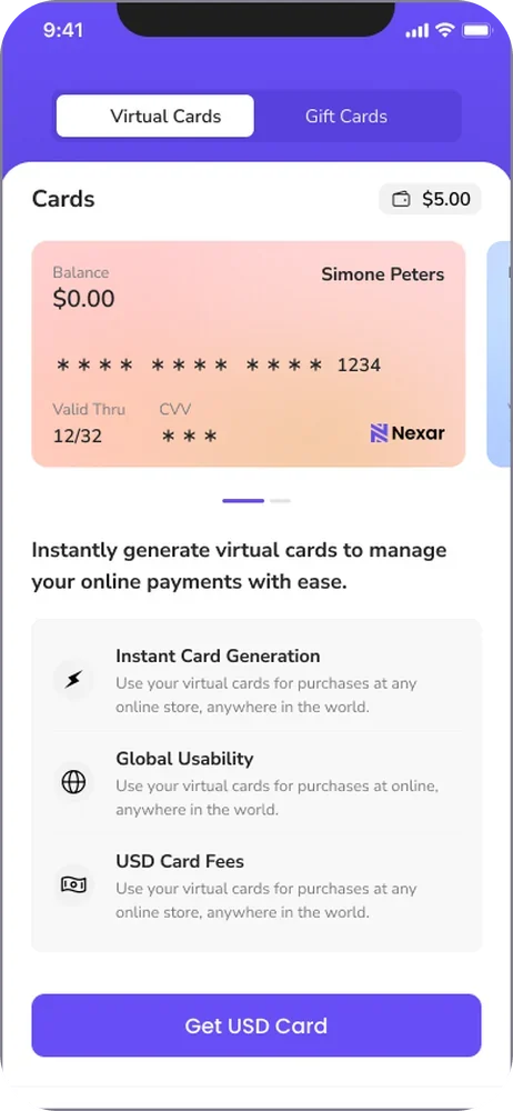
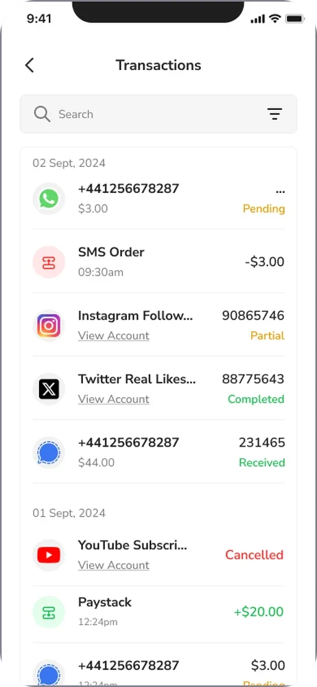
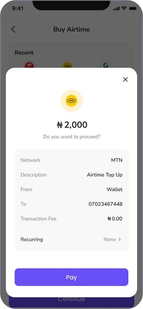
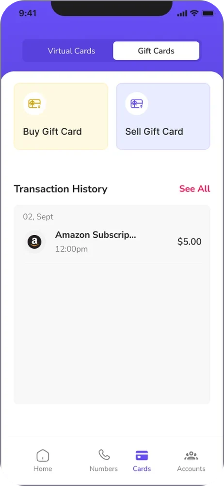
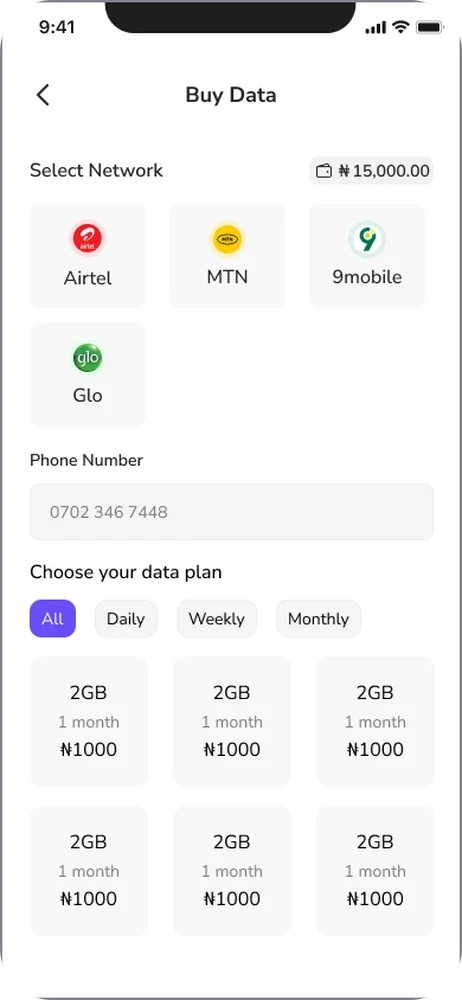
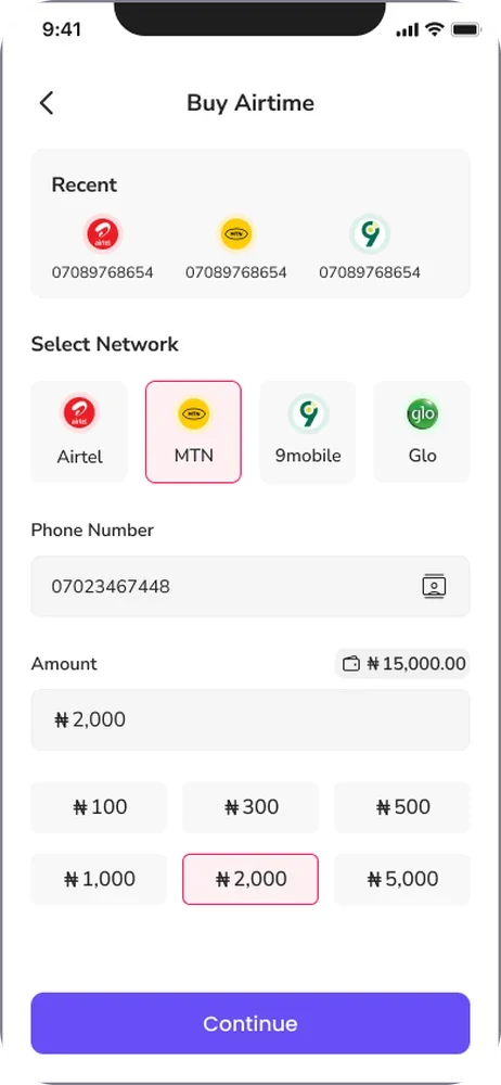
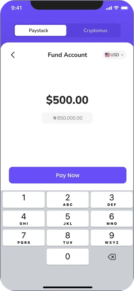
My approach centred on understanding the different tasks users came to Nexar to complete and designing clearer, more intuitive paths to achieving them.
I revisited the platform's information architecture, redesigned key journeys, and simplified interactions across services such as eSIM purchases, bill payments, virtual numbers, and social media boosting.
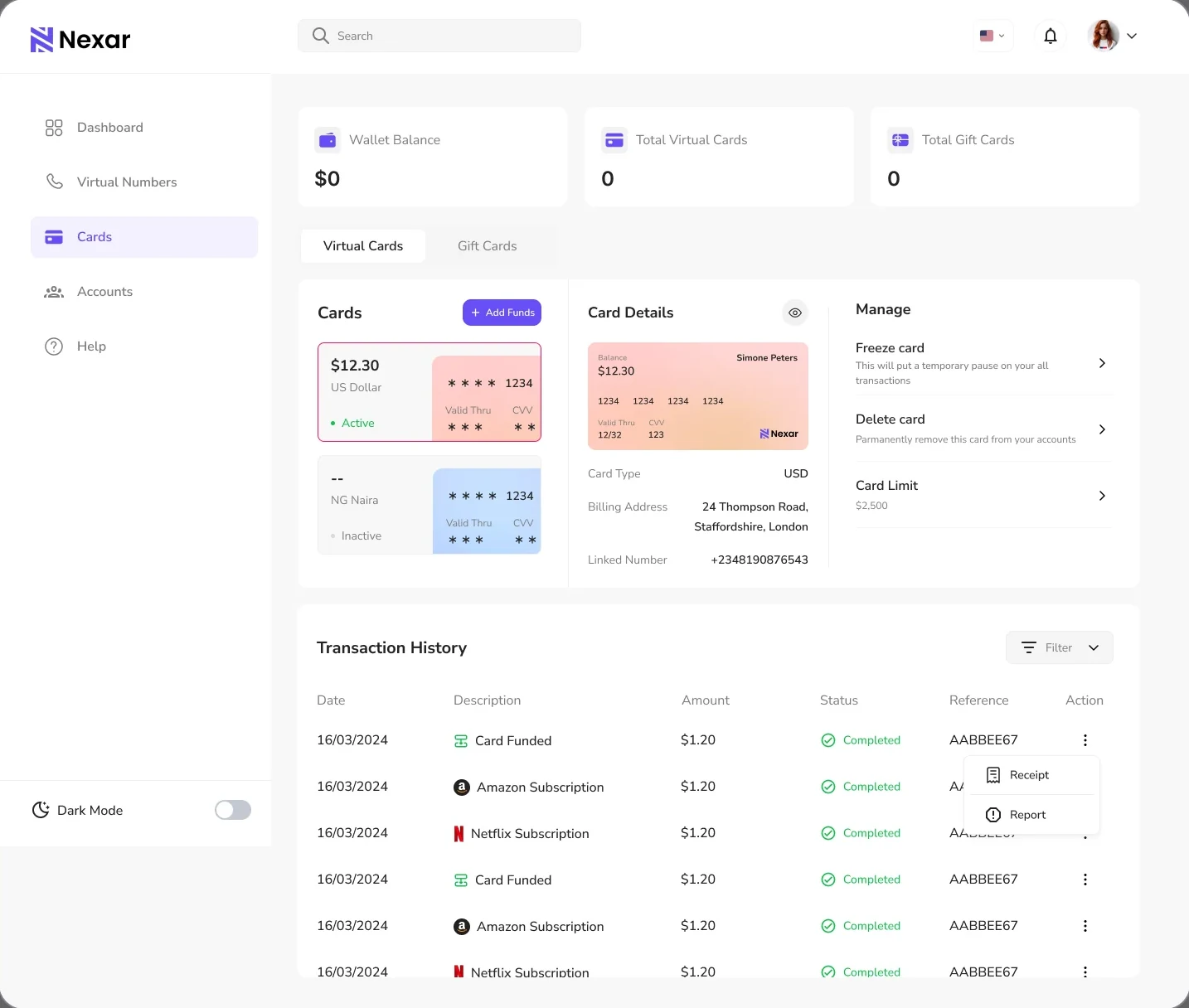
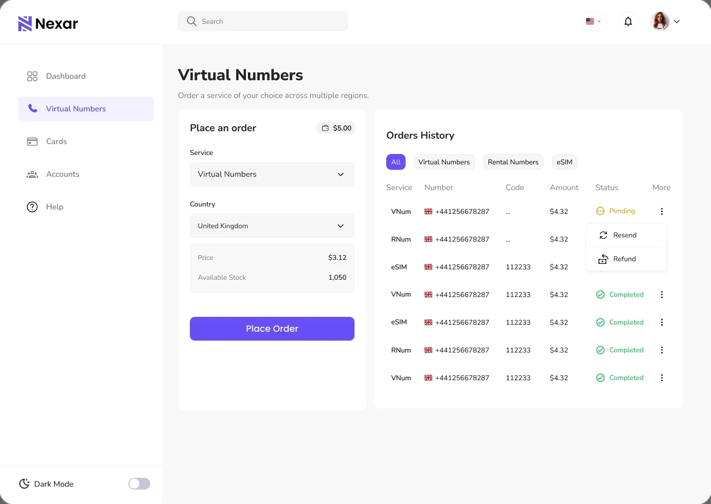
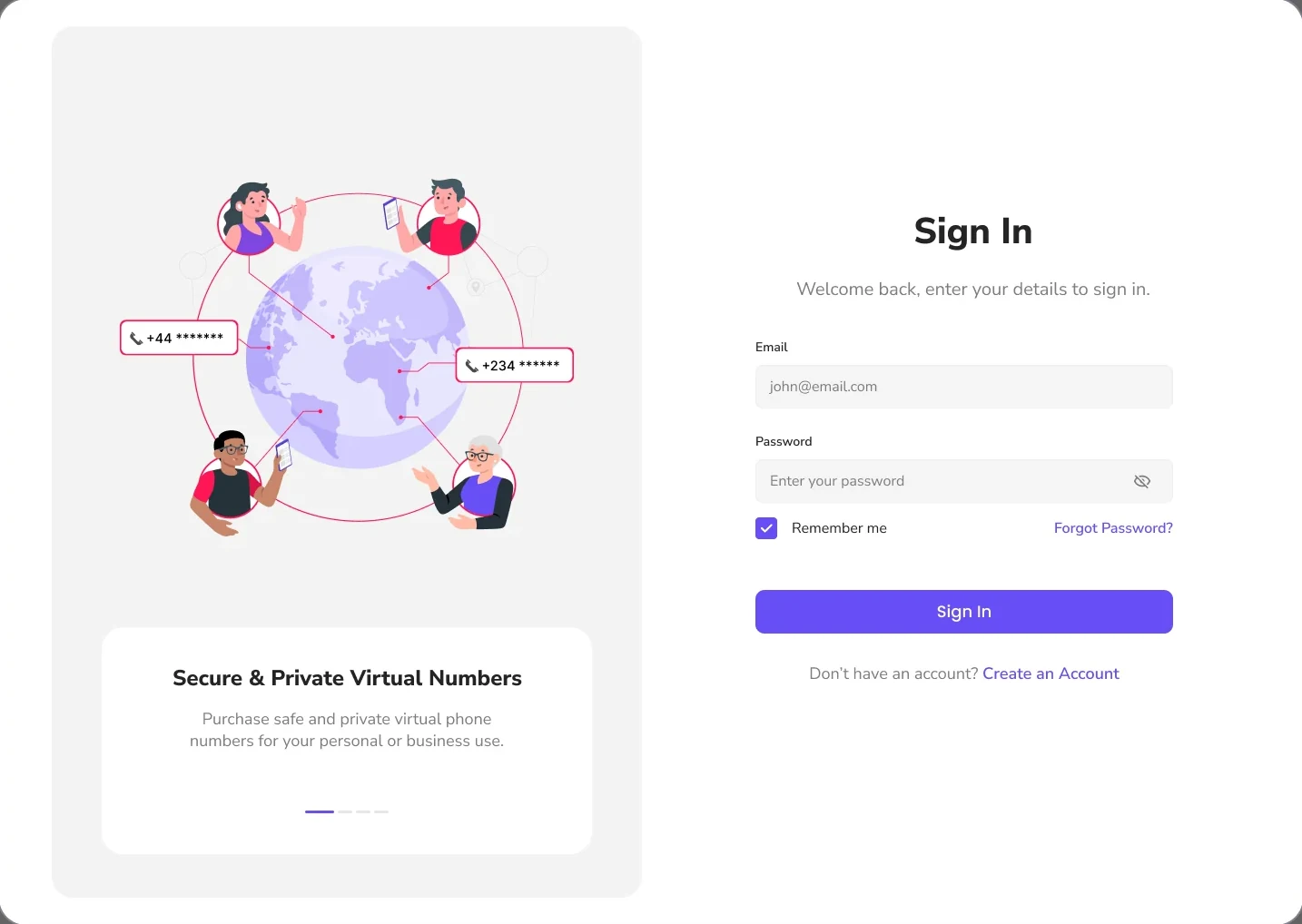
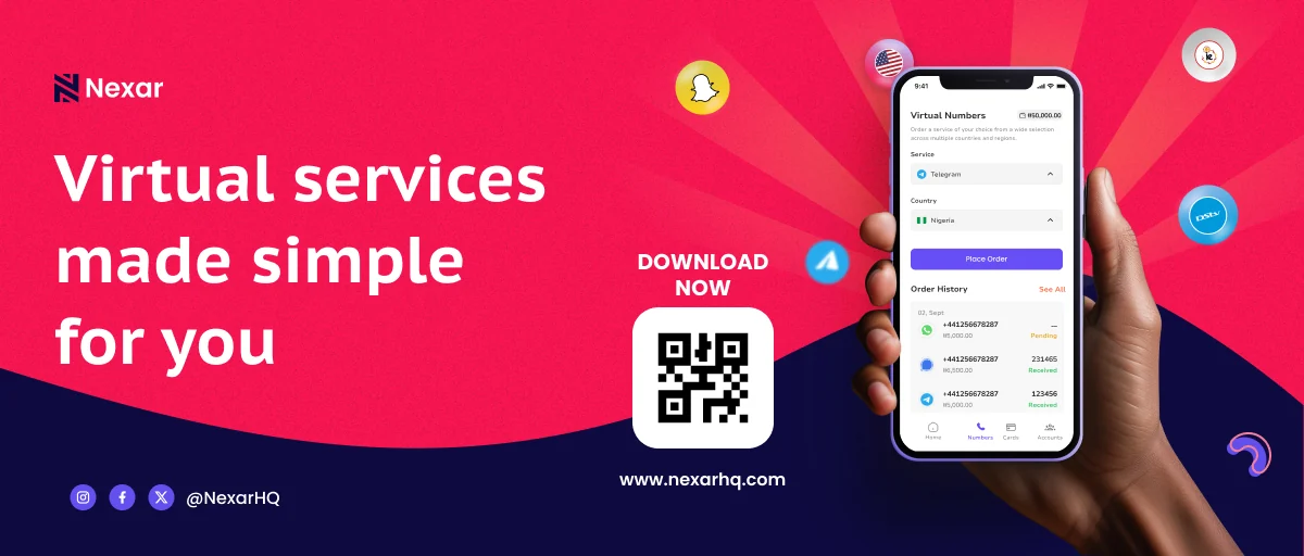
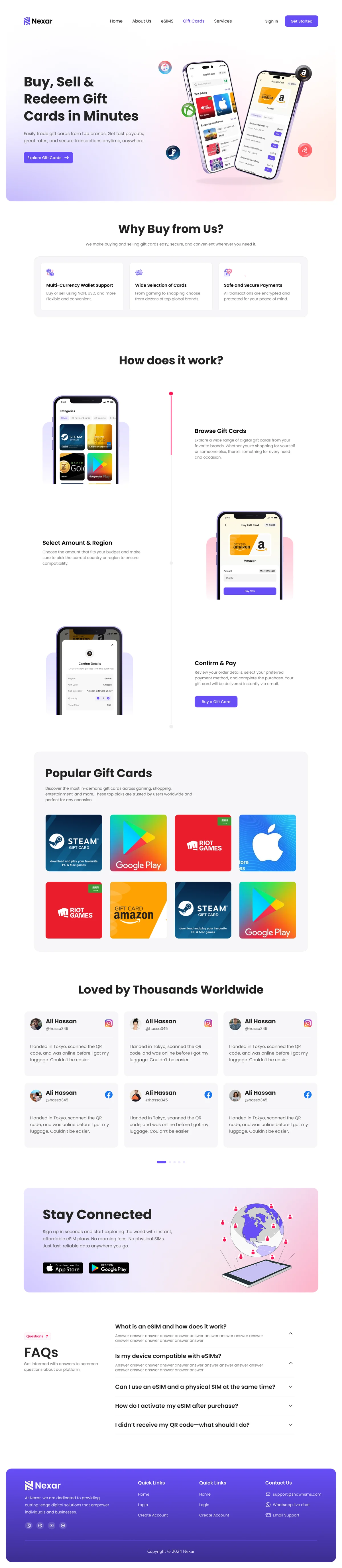
Beyond the mobile experience, I designed a web application to extend the product across devices, alongside the marketing website and visual assets for social media and promotional campaigns.
Across these touchpoints, my focus was on creating a consistent, recognisable experience that balanced user needs with business goals, making the platform easier to navigate while strengthening its visual identity.
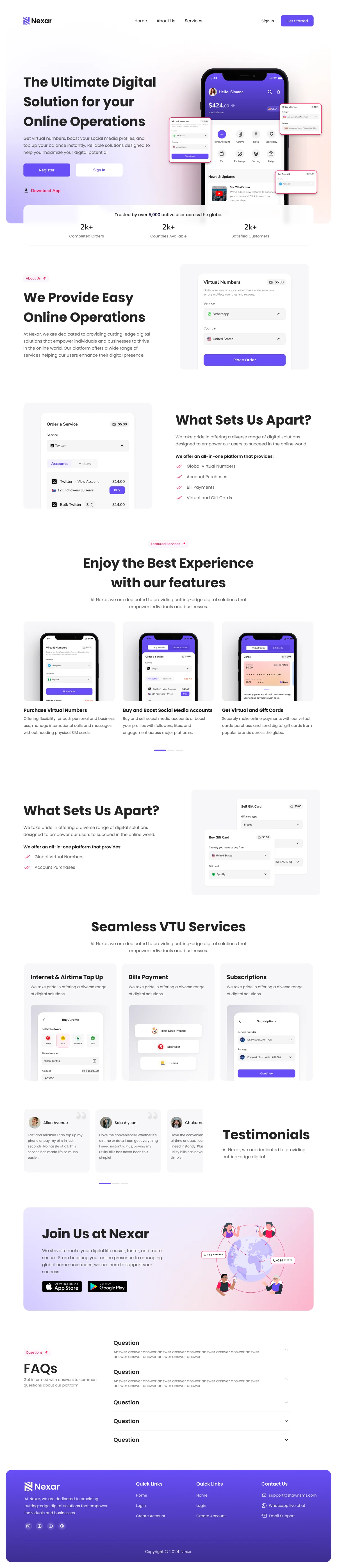

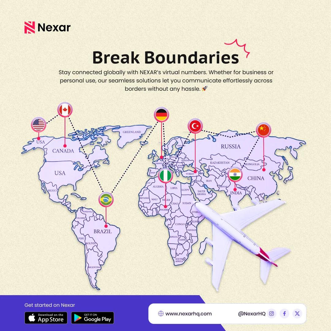
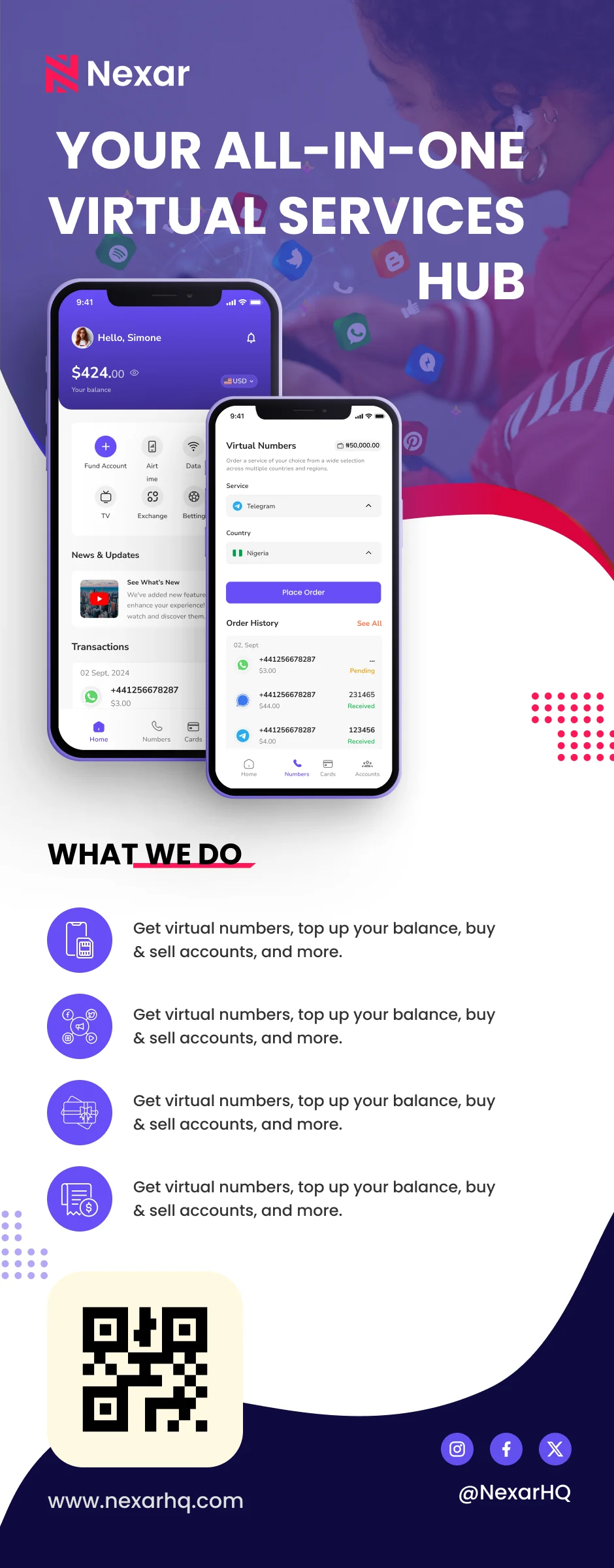
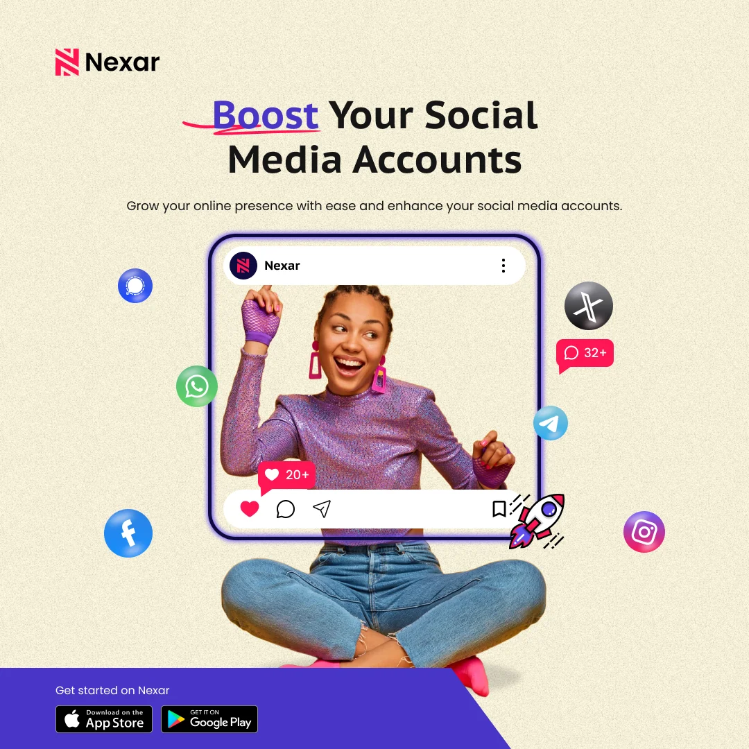
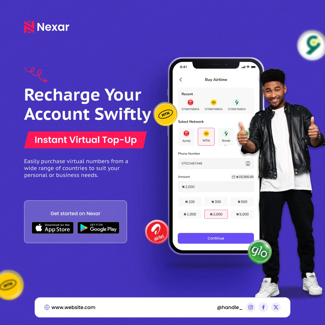
The redesign brought a more cohesive approach to how users discovered, accessed, and interacted with Nexar's services.
By simplifying task flows, improving visual hierarchy, and establishing more consistent interaction patterns, I helped shape an experience designed to make everyday transactions easier and reduce unnecessary friction.
The work also extended beyond the product itself, connecting the mobile app, web experience, website, and marketing visuals through a more unified design direction.
Rather than treating each service as a separate experience, the goal was to make Nexar feel like one platform where everything works together.
Leading the redesign challenged me to consider how different services, user needs, and business objectives could come together within one intuitive experience.
It also gave me the opportunity to work across product and graphics design, strengthening my ability to create consistency between how a brand looks, communicates, and functions.
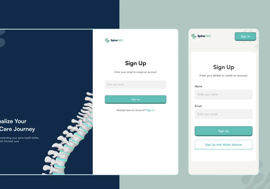
SpineDAO is a healthcare innovation ecosystem focused on improving spinal care through technology, clinical expertise, and data-driven solutions.
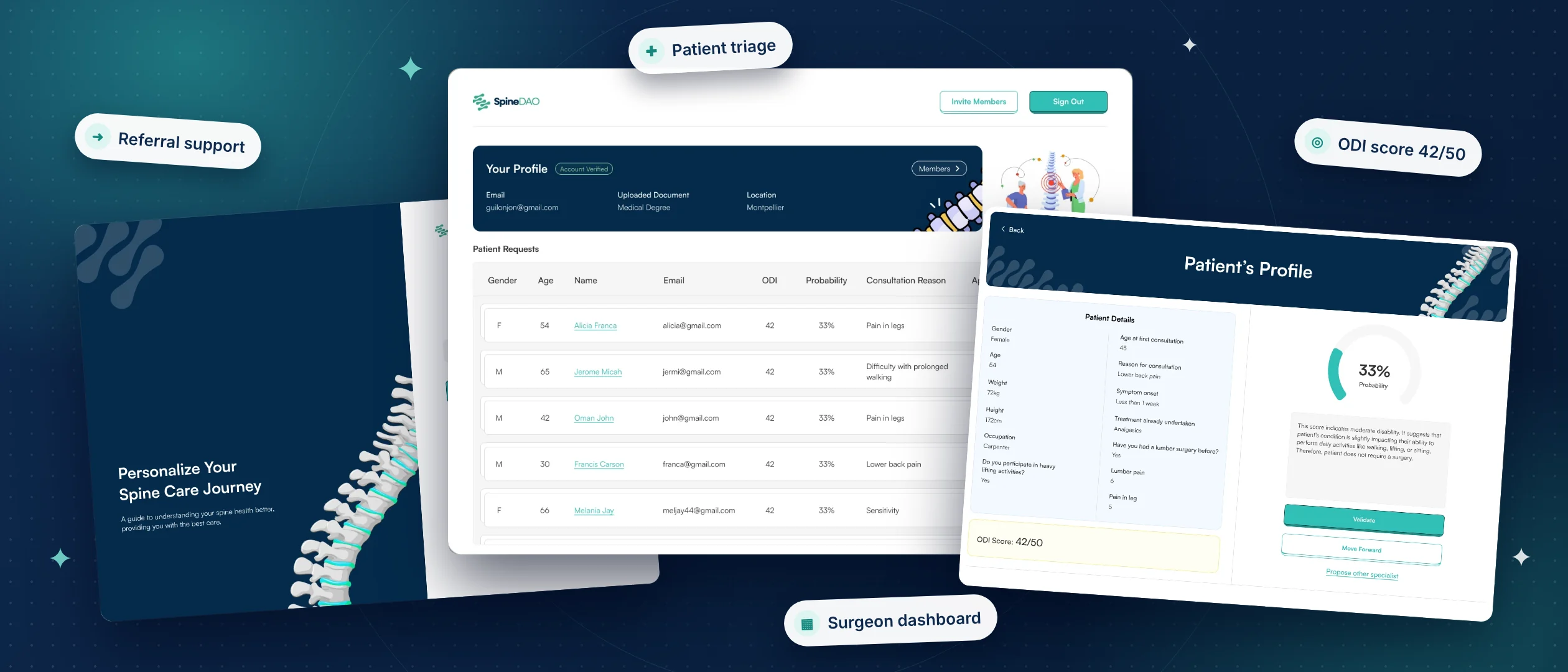
For patients experiencing spinal conditions, getting the right medical attention can mean navigating long waiting times, multiple appointments, and uncertainty about the care they actually need.
Meanwhile, surgeons spend valuable consultation time evaluating patients who may not require surgical intervention, leaving less time for those who do.
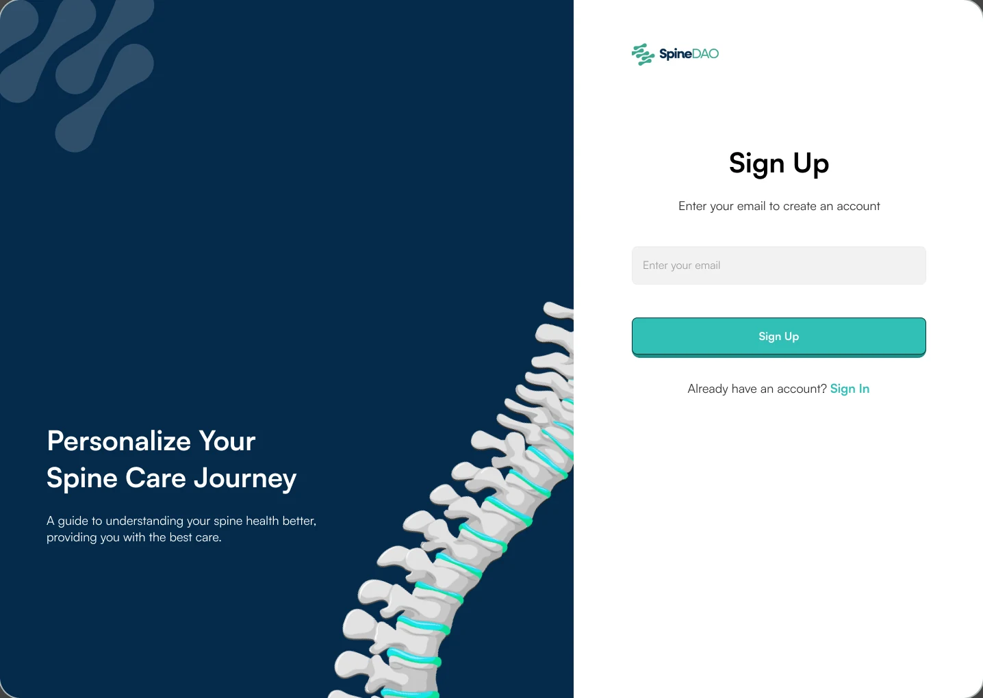
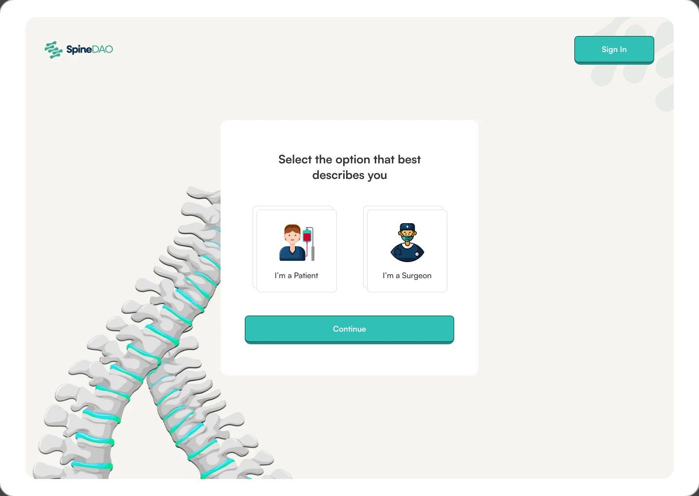
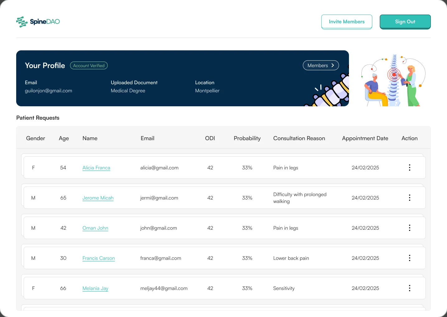
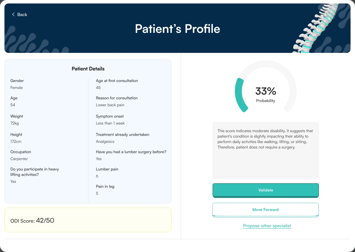
I worked as a Product Designer on Filter, a patient triage and referral platform designed to streamline consultations, help surgeons prioritise patients who require specialist attention, and guide others toward more appropriate care pathways.
Not every patient experiencing spinal pain needs surgery, but determining who does often requires time-consuming consultations and clinical assessments. This creates challenges on both sides. Patients may wait unnecessarily for specialist appointments, while surgeons spend time reviewing cases that could be managed through alternative treatment pathways.
Which left one central question: how do we give patients timely medical guidance, while letting surgeons focus on the people who need them most?
The challenge was to create an experience that simplified patient assessments and appointment management without compromising the quality of care or communication.
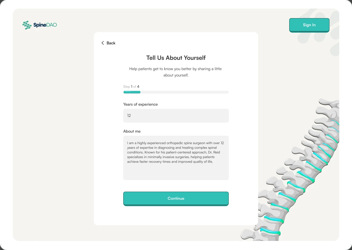
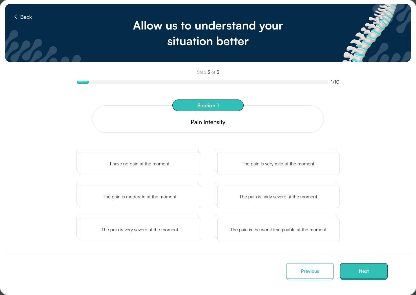
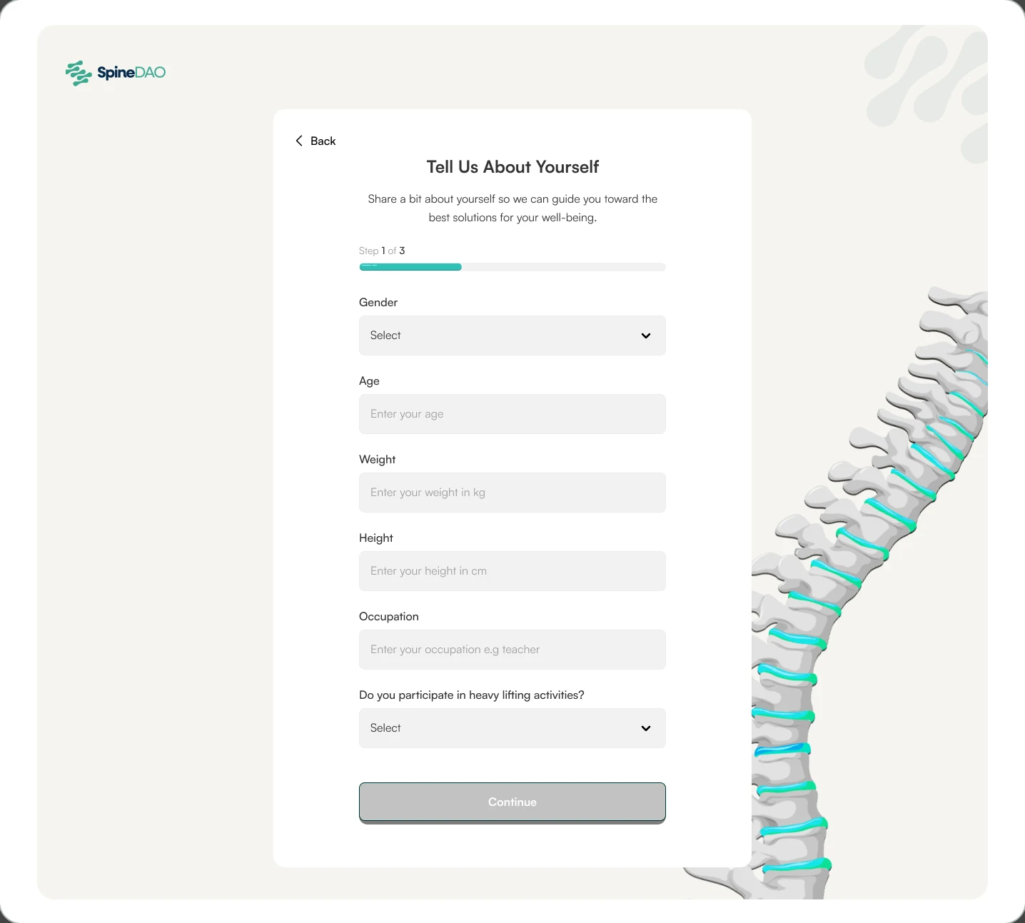
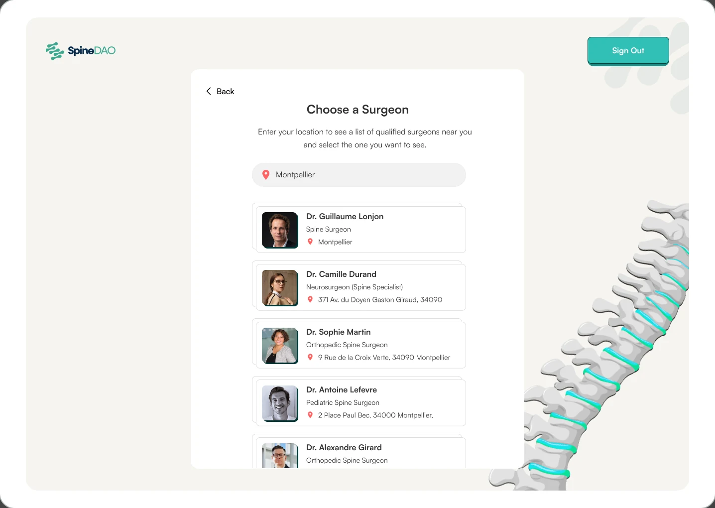
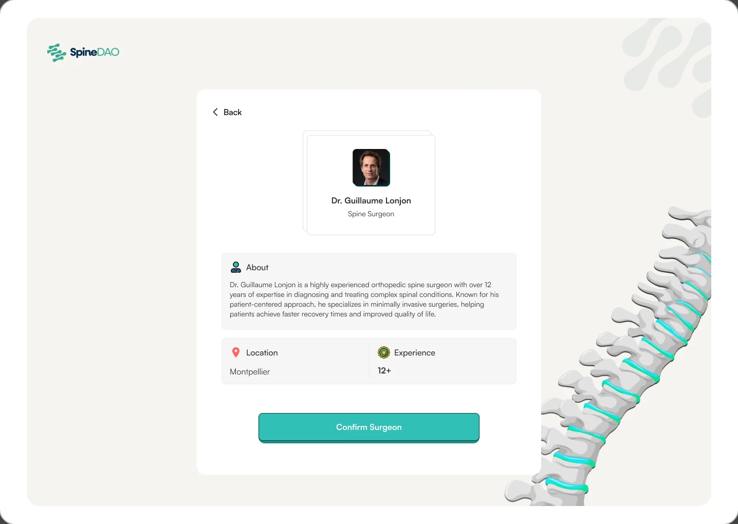
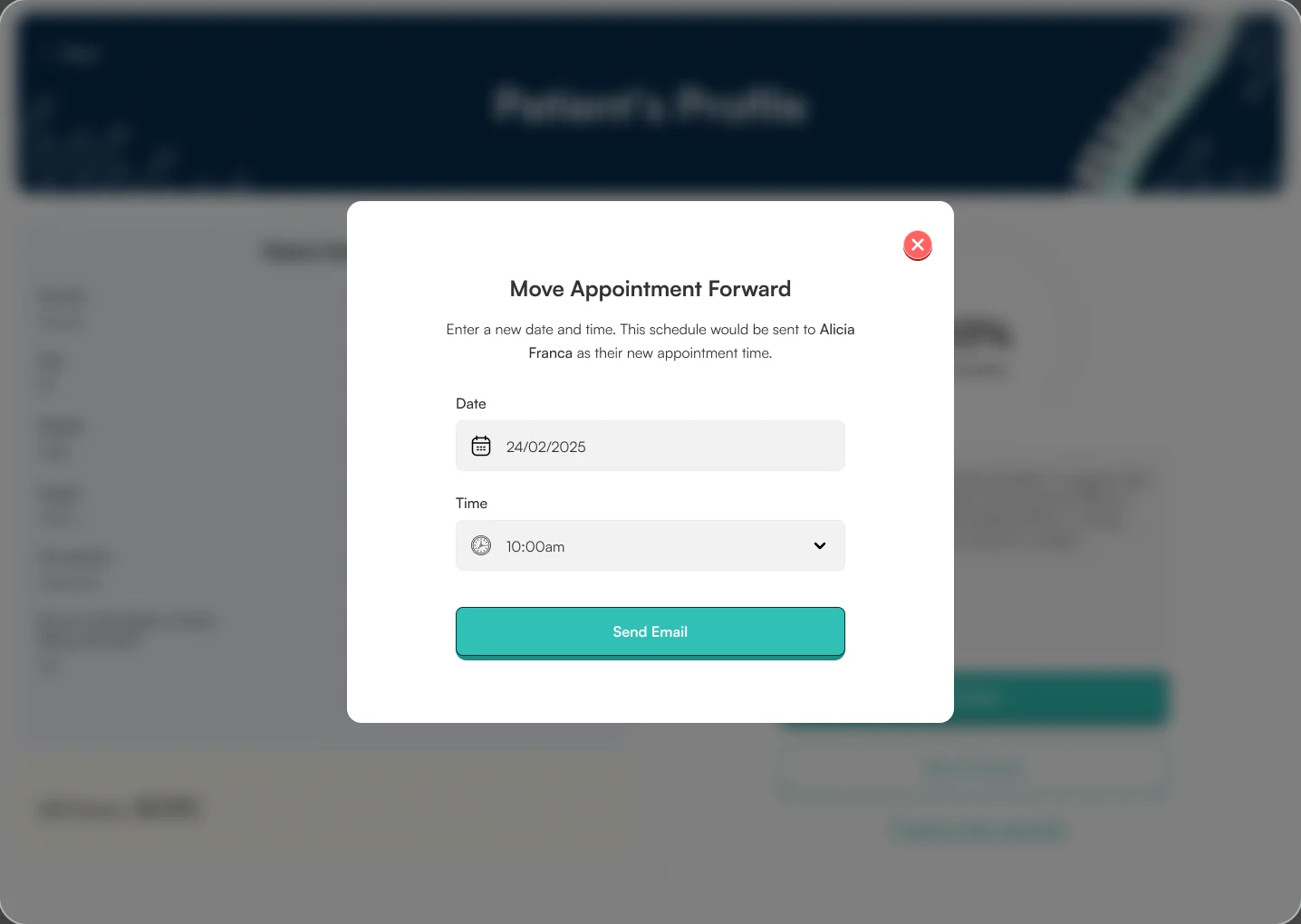
I designed the web experience for both patients and surgeons, focusing on making the consultation and triage process intuitive, efficient, and accessible.
Working closely with surgeons and engineers, I explored existing clinical workflows to understand how appointments were scheduled, what information surgeons needed to assess patients, and how cases could be reviewed and prioritised more effectively.
These insights informed the design of patient intake journeys, appointment scheduling, surgeon dashboards, and consultation workflows.
For patients, the focus was on making it easier to provide relevant medical information, navigate consultations, and receive clear feedback on the next steps in their care.
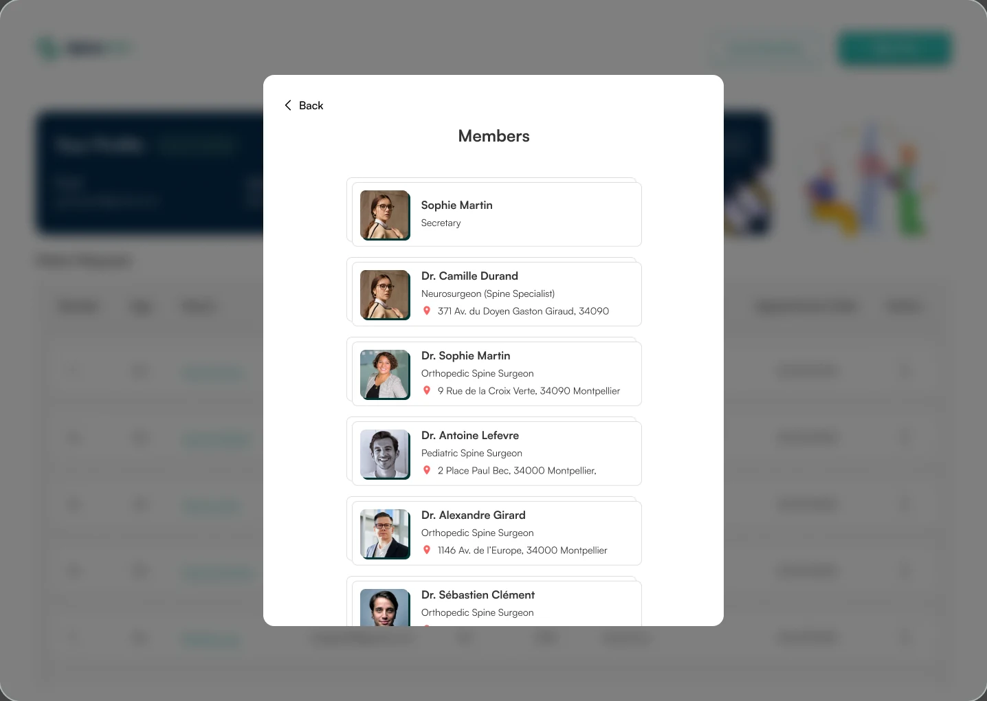
For surgeons, I designed dashboards and workflows that made patient information easier to review, appointments easier to manage, and cases easier to organise according to their clinical needs.
Throughout the process, I balanced usability with the practical requirements of clinical decision-making, collaborating with the team to refine the experience.
The resulting web experience brought patient intake, consultation management, and clinical review into a more structured workflow.
By simplifying how patients shared information and how surgeons accessed and managed cases, the designs aimed to reduce unnecessary administrative effort, support more efficient consultations, and improve access to appropriate care.
Rather than treating every patient journey the same way, Filter was designed to support a more considered approach, helping clinicians identify who needed specialist attention while ensuring other patients could receive relevant guidance.
In short: less time navigating the process, more time focused on the care that matters.
Collaborating directly with surgeons taught me how important it is to understand domain-specific workflows rather than make assumptions about how professionals work.
It also challenged me to design for two very different user groups, balancing the need for efficiency on the clinician's side with clarity, reassurance, and accessibility for patients.